How to build a mobile app: Build cycles

Every business has a process, just like every recipe has a set order of steps – and, just like a recipe, if a business’ process is out of order or incomplete, the final product can end up tasting pretty bad.

Developing a mobile app is no different – missing (or incorrectly implementing) a single step of development can throw a wrench in the process, causing days or sometimes even weeks of delays and re-structuring code.

Every developer has their own tweaks and differences in their development process, but the overarching steps are generally universal in their order. You wouldn’t bake a cake and then put in the flour, after all.

The mobile development cycle

  1. Research
  2. Design
  3. Prototype
  4. Determine feasibility
  5. Program
  6. Test
  7. Publish
  8. ASO & app marketing

These steps, while ultimately implemented in this order, do share some give and take, especially between steps 5 and 6; a dev team will program and then test – and after finding bugs, may return to any point of the process depending on the problem that was discovered.

This method of coding, testing, and then coding again is what’s called agile development. Dev teams that work within an agile development cycle work in sprints – coders will build a feature or feature set usually over a period of one to two weeks (we like to work in one week sprints to really take advantage of agile’s full potential), test the build, debug, and then implement their current branch into the master branch of code.

But, before we get more into steps five and six, let’s talk about step one…

Research

This is possibly the most important step of any business venture – without properly researching your target market, audience, and the competition you will face, there’s no foundation to build a solid structure upon. The story about the three little piggies? Yeah, it’s like that – but it’s your money being blown away, not straw. As we’ve gone over before, there are a few questions to ask that can help guide your research:

  • What do I want my app to accomplish?
  • What platform(s) do I want my app to be on?
  • What is my competition?
  • What is my time table?
  • What is my budget?

Some of these questions will lead the direction of your research, and others will be answered by your research. For instance, your findings about your target audience will dictate what platform(s) you will publish your app on, while knowing what you want your app to accomplish will determine the target audience you will want to tap into. If you want to build a productivity app, for example, your target audience will mostly be persons over the age of 25, while a mobile game might go after a target audience in their teens.

Other times, finding an untapped market might dictate what you want your app to accomplish – there’s a lot of research methodologies out there – but no matter what, every step you take should be to figure out the best way to solve your intended audience’s pain point.

What’s a pain point? Let’s pretend our target audience is… squirrels. Yeah, squirrels. You’ve seen a lot of the furry critters complaining on social media about always losing the acorns they’ve buried, and you’ve decided your going to build an app that helps them keep track of their acorn haul.

The pain point is squirrels are constantly losing acorns – your app, and everything it does, is intended to solve it.

Design
Sketch

Good design is the blending of both form and function to create a simultaneously visually pleasing and useful tool that provides the functions necessary to solving your users’ pain point.

In other words, don’t just make something that’s pretty – make it work for your users. A good way to go about getting into your users’ heads is to come up with user stories; a helpful tool for figuring out what design choices you should make, and how the functions of your app will flow together.

For example, our squirrel-based acorn finder app (which from now on will be referred to as Nutsapp) should have a pretty simple design, as it really only needs to accomplish a few functions to solve the squirrels’ pain point:

  1. Provide users with a map of the surrounding area using GPS
  2. Allow users to place geotags where they’ve buried acorns using location services
  3. Store the geotags in searchable lists – e.g. “acorns by proximity” or “acorns by date buried”

So, we have our user story; a squirrel buries an acorn, opens Nutsapp, places a geotag on their map, and eventually, searches a list to find it again. Based on that, we can create wireframes to determine how the information will be displayed on the squirrel’s mobile device, and based on those wireframes, we can build the UI of the app itself in a program like Sketch.

Then it’s on to the next step…

Prototyping

During this next phase of development, the designer of Nutsapp would build the prototype in a program like Invision. This is where UX is the main focus – prototyping is used to determine whether or not a design makes sense when actually used to solve the pain point of an app.

The development team should always keep in mind use case scenarios during this step – if the app’s flow doesn’t make sense, it’s time to go back to the design phase.

There’s a lot of back and forth between prototyping and design – and that’s a good thing. This is the first step that designers and programmers work with each other, and together, they can determine the next step of the development phase.

Feasibility

Once the programmers for Nutsapp have looked at the prototype, they can then determine the feasibility of its functionality. The programmers will look into whether the necessary back end integration is achievable or not, and determine what APIs will be used to provide users with the functions Nutsapp needs to work.

If a part of Nutsapp’s design isn’t feasible, the programmers will usually work with the designer to figure out a good way to achieve the necessary UX and functionality while still working within the realm of what’s possible to code.

Programming

Coding

Speaking of code, this is where the magic happens. Programmers will take the designed UI/UX and build based on the prototype provided (which is why it’s so important to nail down look, feel, and feasibility of the prototype before moving to this step).

Usually, devs will:

  1. Build the UI
  2. Connect the UI to the code that makes it actually function
  3. Define the data model (the structure of information in the app)

If the dev team is working within the agile method, after each sprint, the team would meet up, discuss their progress, test the functionality, and determine the goal of the next sprint based on the findings of the testing. This cycle is repeated until the app is completely built.

Testing

While Nutsapp’s dev team has been testing after each sprint, after the app has been fully coded, it’s time to move on to beta testing. This is an important step, because it gives you the chance to see how someone who has no knowledge of the inner workings of Nutsapp interacts with and navigates the functions within the app.

It might feel a little disheartening, but do your best to try to break your app. Push every button you can faster than a squirrel normally would, attempt to complete steps out of order, and see what happens when information is input incorrectly.

When you find bugs – and most likely, you will – go back to the programming phase, and fix them. It’s always better to find and fix bugs before launch, even if this delays the launch of your app. Squirrels, just like users, are skittish, and any hiccup in the UX of an app can cause your target audience to abandon your service.

Publishing

After (throughly) testing and de-bugging your app, it’s time to move on to publishing. Both the App Store and Google Play have different publishing rules, and if you’re searching for a quick rundown, look no further than our How much does it cost to make an app? blog.

ASO & app marketing

We’ve gone over ASO and app marketing before (multiple times, in fact), so if you want to go over both the basics and the nitty gritty, visit all three of those blogs.

Your ASO and app marketing campaign are mostly based off of your findings from the first step of the development process – research, and as such, your ASO and marketing campaign should be developed over the course of the entire process. The reason we’ve listed this step last is because ASO and app marketing never end.

Your competition is constantly changing, along with the needs of your users and the trends they expect to be followed. A few ASO rules to always follow are:

  • Update your app frequently, but not unnecessarily
  • Use A/B testing on your app’s page on the App Store (or Google Play) to determine what works best to capture your audience’s attention
  • Keywords, keywords, keywords – look at what keywords your competitors are using, see what you can do to beat them, and figure out keywords they aren’t using to their full advantage to capture an untapped segment of potential users

Your ASO and app marketing efforts should work in tandem – people generally use the search feature of both the App Store and search engines like Google in the same way. If a squirrel is searching for “acorn finder” in Google, they’re most likely going to search for the same thing on the App Store.

Some sections of your app’s page on the App Store don’t rank for keywords, so consider putting your most important and strategic keywords in your app’s title, after the actual name of your app. In the case of Nutsapp, this would look like: “Nutsapp – Acorn Finder.”

Agile development fits its namesake

It’s called agile, because that’s what app development needs to be – adaptive to the issues every development cycle will face, and quick to respond and fix those problems.

How can the tech and green sectors work together?

Let’s all face it – there’s a clock, and it’s ticking down the seconds until we run out of the lifeblood of all tech – rare earth metals.

The problem with batteries

If you’re using anything other than a desktop computer that remains plugged into a wall socket, that device uses a battery for energy storage, which is – almost invariably – made of lithium (and other materials). Un-surprisingly, as a rare earth metal, lithium isn’t plentiful or renewable, and its reserves, just like any finite resource, will eventually deplete.

Some investors and analysts aren’t worried, as even if lithium battery production triples, there’s still 185 years of the resource scattered around the globe, just waiting to be mined.

Those concentrations of lithium are, however, often located in pristine wilderness like the English countryside or buried under land that belongs to indigenous peoples; over half of the world’s lithium reserves reside along the border of Chile and Argentina, home to herders who live on the Atacama Plateau, a land they consider sacred. The people of the Atacama Plateau are concerned about the water shortages and pollution that invariably comes along with mining operations – not to mention the inescapable geological scarring to their land.

Even if the ethical and environmental concerns aren’t worrisome for the tech sector, that number of 185 years should be. This projective estimate is based on a mere tripling of lithium usage for batteries – which is also used in the production of a lot of other materials; over one third of mined lithium goes to the fabrication of ceramics.

To make things worse, this isn’t just about smartphone, tablet, and laptop batteries – as the EV market expands, the estimated time that reserves will linger shoots way down. If there were 100 Tesla Gigafactories, we’d have enough reserves of Lithium to last 50 years. That many EV factories isn’t a stretch of the imagination – in 2015, 565,000 EVS were sold globally. In 2018, 2,018,247 million EVs were sold across the world – and that’s just passenger vehicles. That’s a market share increase from 0.38% (2014) to 2.1% (2018) in just four years.

EV growth

As you can see above, this chart from Wikipedia shows annual sales of EVs are following the trend of exponential growth. As the auto industries in China and India begin to expand, this growth will only increase – and rapidly.

Still, many market analysts aren’t concerned; as this article on Bloomberg states, even if the cost of lithium were to increase by 300%, the price of a battery pack would only rise by a meager 2%. But this isn’t the real issue – no matter how economically feasible lithium remains, it’s still a finite resource. Earth is, after all, a closed system (other than a stray meteorite every once and a while) and while lithium is found in the ground, that doesn’t mean it grows there.

And what happens as the solar sector increases? In 2010, 0.1% of the United States’ energy production (which has been slow to adopt solar technology when compared to other countries) came from solar – that percentage has grown to 2% in 2018. For the past five years, solar has either come in first or second place for the winner of most installed type of energy production in the U.S., and even with current tariffs, is continuing its trend of rapid growth.

All of this energy produced by solar cells has to be stored somewhere – batteries. Wind power faces the same struggles with long term energy storage as well.

Last but not least, for the second time in as many weeks, we’ve got to talk about robots. It may be a few years off, but the robot revolution is coming – Spotmini (I swear I’m not on Boston Dynamic’s payroll, I just love this little guy) is projected to come to market this year.

Now I, along with everyone else who is old enough to have been self-aware in 2002, remember the promise of the Roomba; it was supposed to change vacuuming forever. And it didn’t. But the robots being developed now aren’t automated vacuums – they do their own stunts, act as fish-mimicking marine biologists, and can open doors.

Remember when the iPhone first came out? Sure, people thought it was cool, but we already had Mp3s and cellphones. A lot of people didn’t want this new-fangled “smartphone” – they were expensive, and the iPhone wasn’t capable of doing anything any other combination of laptop, cellphone, and Mp3 couldn’t. No one could have expected this device to produce its own industry and boost so many others.

Let’s go back – way back – to Times Square, ca. 1905.

Times Square

Photo from Library of Congress

Horses and buggies everywhere. Next, let’s look at the same place just six years later, in 1911:

Times Square

Photo from Library of Congress

There might be a horse in that photo somewhere, but there are a bunch of cars. The iPhone was released in 2007, and by 2013 – the same amount of time that passed between those two photos of Times Square – smartphones had flooded the market. Now, just as it’s practically impossible to get around the U.S. without a car, it’s difficult to stay up to date and function professionally without a smartphone.

Once a few trend setters start showing off their Spotminis fetching items, holding open doors while they carry in groceries, or even just following them around like their very own robot dog, you can bet people will follow suit. Envy is a powerful emotion, and a widely used sales tactic due to its power over our psychology.

Bezos and Spotmini

Who doesn’t want to feel like Jeff Bezos?

So, the point is; soon, batteries (and the lithium that they are made with) won’t just be limited to laptops, tablets, smartphones, wearables, cars, and wind and solar energy. Robots will probably (definitely) have a huge impact on lithium’s demand.

It doesn’t matter if the price of lithium only goes up by 2% – at some point, in the not-so-distant future, we’re going to run out of the stuff.

So what are we going to do?

I don’t know, I just work here – but some very smart people are working on solutions.

  • Researchers have figured out a way to not only capture CO2, but sequester it and the fabricate the carbon into electrodes.
  • Alphabet owned, Cambridge-based Malta has made a heat pump that uses molten salt and antifreeze to store energy, and then convert it back into energy using a heat engine – this could store energy for weeks.
  • Numerous companies are searching for a new form of battery – flow batteries. These use electrochemical processes to store a charge.
  • There’s still a lot of ground to cover, and many bridges to cross. Hopefully, as the tech sector moves into the 2020’s, it can evolve to meet the needs of both users and the earth.

Can mixed reality give humans the edge over automation?

There’s a trend that’s been around since the dawn of the industrial revolution – if you can build a machine that automates the process of a worker (or workers), it will be more efficient in almost every way – cheaper, faster, and more accurate. At first, this trend wasn’t all that worrisome – while some jobs were made obsolete by automation, so many new fields and industries were created that workers had more job opportunities than ever before.

Like any new facet of technology, however, automation slowly (and then not so slowly) began advancing – taking a lot of jobs with it. But workers found a new avenue of growth through the rise of the service industry, and while manufacturing positions were pushed to the wayside, the economy found a way to capitalize on the trend of automation.

This automation, in the same manner as during the industrial revolution, opened up entirely new industries with millions of jobs to fill; the stand-out of the 2010’s being social media. The best part was, these jobs seemed future proof; the future was digital, and social media was a new form of digital communication by humans, for humans.

And then along came artificial intelligence.

If you had asked someone in the 90’s, 00’s, or even very early 10’s to imagine A.I., they’d probably have described a large supercomputer, housed in something akin to the datacenters integral to Silicon Valley and government digital operations around the world, calculating the great philosophical questions that have plagued humanity since the dawn of time; What is the meaning of life? What is the true nature of the universe? Where do we fit in amongst all of this?

Well, it turns out that while A.I. isn’t to the point where it can answer with “42” yet, it is really good at doing tasks that were largely unexpected just a few years ago – like diagnosing medical conditions, driving cars, and even writing prose. Deep learning neural networks are just plain better at processing vast quantities of data when compared to humans, and more than likely, if there’s a task that is processed through a digital medium, A.I. will, with time, be better at that task than humans.

Social media algorithms are already wreaking havoc with elections across the world by influencing millions of users – and with much more efficiency and effectiveness than any marketing team could ever hope to achieve themselves.

If humans were, for instance, Batman, A.I. would be Bane – just as the dark knight merely adopted the darkness, humans adopted the method of processing data via a digital interface – A.I. was born into, and is better adapted to this digital environment. We’re like the first creatures to move from the sea to land; just as our lumbering ancestors struggled against gravity, we interact with digital mediums with very low input/output when compared to A.I. – most of the time, our input is our two thumbs, and our output is limited to the processing power of one brain.

A.I., on the other hand, inputs and processes information orders of magnitude faster than we can – it was designed to work with 1’s and 0’s, while we work within a whole host of sensory and emotional data. Plain and simple, given enough time, A.I. will replace almost every job that works within a medium provided by a computer.

Take, for instance, the Space-X December 2018 Falcon 9 landing failure. The re-usable rocket’s first stage had a malfunction during re-entry – the hydraulics that control the grid fins which stabilize the rocket stalled. The flight computer, which assesses the situation during re-entry, detected the malfunction, and went into a “safe” landing mode – meaning it aimed for the ocean, and not the pad. The flight computer is smart; if an ocean landing is impossible, it is programmed to avoid buildings and people. But what was truly astounding was the flight computer using algorithms to learn – in real time – a method to stop the seemingly out-of-control spin by using the rocket engines themselves.

This hadn’t been pre-programmed; the rocket took in data, processed it, and then improvised. Fully automated, without any input from ground control. Let that sink in for a second – the first stage of a re-usable rocket malfunctioned upon re-entry, and improvised a safe landing using methods of control it was not programmed to, in order to slow (and ultimately regain control of) its descent into the ocean – by itself.

If this were 2014, that would be the plot of a sci-fi short – not a widely covered news story.

Luckily for us slow-input humans, rocket landings aren’t an everyday occurrence (yet). There’s still jobs to fill, work to be done. There are still plenty of things humans do better than A.I. and robots. We still have time to develop ways to keep up (and frankly, in certain fields, catch-up) with A.I., robotics, and the ever-looming presence of automation.

Augmented Reality (AR) and Mixed Reality (MxR), as Microsoft’s HoloLens 2 exemplifies, might be our method for keeping up with the advancement of automation in the near future.

Our edge against automation

As Boston Dynamic’s Spotmini has shown us, robots, just like velociraptors, can now open doors – or moonwalk, if you prefer. Atlas can backflip, turn 180 degrees in the air, and even run. But we’re still a lot better at this kind of stuff than robots. We’re much more adaptable – while a robot surgeon has higher dexterity than a human surgeon, it’s not going to build a car anytime soon. But with enough training, a human could become proficient at both surgery and auto repair.

But that training takes time, which takes money. If a manufacturer can spend $100,000 on a machine that takes the place of a human worker, they will – and a large part of that is due to the robot requiring zero on-the-job training.

Where automation is limited (for now, at least) is the number of functions a single robot can perform. Tesla’s Gigafactory, which was built with the idea of one day being fully automated, exemplifies this with its cautionary tales of too much automation too soon.

There’s no doubt humans are more adaptable than computers – we came to be the dominate species on this globe for a reason – so what would happen if we could learn almost as fast as A.I. algorithms?

First, when universal A.I. comes about, this is all null and void – there’s no way we could keep up with an intelligence like that – but for now, MxR might be what gives humans the edge over automation.

We’ve covered the enterprise applications of AR before – but with the release of the HoloLens 2, the power of MxR is becoming rapidly apparent. There have already been a lot of cool methods for bringing MxR into manufacturing, but due to the wearable, hands-free nature of the HoloLens, MxR is now a truly viable option.

First of all, you wear HoloLens on your head, and when it’s not in use, you can flip it up, akin to a welder’s mask. Microsoft put a lot of time and effort to make sure it was comfortable, allowing workers to wear it for extended periods of time.

The actual area on which images are projected (called the field of view) is larger than the HoloLens 1, which was released in 2015, made possible by mirrors called MEMS that project visual data at 120 FPS. There have been many other improvements since then as well – a big one being the reduced weight of the HoloLens 2 – and, unlike larger AR rigs, it can provide workers with in-the-field, real-time MxR experiences. Other workers can see what the HoloLens wearer can see via cameras, and highlight objects in real-time. Eye tracking helps to focus in on objects the wearer is looking at, and learns to predict what users will find interesting. Cnet’s Ian Sherr and Scott Stein described this predictive feature as feeling like “practical magic” and that is was almost like having your mind read. These eye-tracking cameras can even read the wearer’s emotions, and can detect who is wearing them – allowing shared headsets to switch from one user to the next without spending valuable time setting up personal options. The wearer can even manipulate virtual objects with their hands.

Ian Sherr and Scott Stein, who are not auto mechanics, were put in front of an ATV in need of repair, as a demo of the HoloLens at Microsoft’s headquarters. They were able to fix it in a short period of time with real-time instructions provided by HoloLens 2.

These features, and their implications, could possibly have a resounding impact on the structure of the manufacturing and production industries. With MxR, workers don’t need training – they only need to be able to follow real-time, visual instructions. They don’t need to have any knowledge prior to completing the task. They have, essentially, access to Matrix-like superpowers of downloading information directly to their brain – without the giant hole in the back of their skull.

And when things fall apart – as they inevitable do – the adaptable humans will still be there to improvise in ways automation physically couldn’t. This might be the crux of what sets MxR enhanced workers apart from automated robots – a worker with MxR enhancements is efficient and precise, but still has the ability to think, and act, outside of the box.

The AR and MxR industry was already worth $6 billion in 2018, and is expected to grow to $200 billion by 2025. That’s a huge leap – and with it, advancement and innovation. As A.I. takes over the digital realm, maybe we’ll regress back to a manufacturing based economy, albeit in a more futuristic way.

How & when to monetize your app

When we’re speaking with clients about their app, there’s one question that pops up more than platforms, UX, features, and maybe even development cost: How will my app make money?

For good reason too – it’s an important question to ask – apps need to make money somehow. Fortunately, there’s lots of ways to monetize your app:

  • Advertising
  • Initial install cost
  • Freemium content
  • Subscriptions
  • In-app purchasing
  • In-app currency
  • Sponsorships

We’re going to get into each of these methods in a second, but first, we need to ask another important question: When is the right time to monetize your app? We’ll look into that after we go over the different ways you can monetize your app.

Advertising

If implemented correctly, ads can bring a lot of profit to your mobile app. This is the most common form of monetization within apps, and for those with large user bases, it can be remarkably profitable. There’s a lot more methods to advertising than the classic banner ad:

  • Interstitial – Fullscreen ads that appear during natural transition points, usually between two different screens in an app
  • Video
  • Native – These are ads that appear to be built into (or native content of) the app – like LinkedIn’s in-feed advertising
  • Rewarded ads

The trick to advertising within your app is making sure the ads both demand a user’s attention and mesh with the UX simultaneously. This can be achieved in a number of ways, a classic example being only selling ad space on your app to companies that offer services or goods your users would be interested in.

Possibly one of the most interesting forms of advertising is rewarded ads. With an eCPM of $16 on iOS, these ads have a very low CPC compared to other methods of advertising. Rewarded ads accept that users really don’t want to be bothered or interrupted by ads – and because of this awareness, they reward the user for viewing them with in-app currency, discounts, extra content, and many other digital rewards. Due to their self-aware nature, rewarded ads see the highest engagement and conversions when compared to other forms of advertising.

Initial install cost

For a lot of apps, an up-front install cost is going to stifle your growth. There are a few types of apps users are willing to pay for, however:

  • Health and wellness
  • Fitness
  • Productivity
  • Specialized services

ASO plays a huge role in convincing users to pay to download your app. As we’ve gone over before, keywords are your key to success on the App Store and Google Play. Your in-store efforts should work in tandem with your website’s SEO and Adwords campaign – utilizing the same keywords for both SEO and ASO gives you a better chance at capturing and funneling users into download conversions.

One thing to keep in mind is that if this is the only method of monetization your app utilizes, your user base must continually grow, or your profits will stagnate. Only the top performing apps really see a huge profit from downloads. For example, in Q1 of 2018, almost 20% of apps on Android saw 10-50 downloads total, while the top 0.1% saw over 5 million – a huge discrepancy.

Freemium content & subscriptions

Both of these methods of monetization work using the same general idea; show your users what there is to offer, get them hooked, and then ask them to pay for more. It’s try before you buy with apps.

Free trials that allow users to explore an app for a set amount of days work well for both consumer facing and internal business apps. If your app’s UX is strong and solves your users’ pain point (and they’ve had enough time to associate your app as the solution), getting them to subscribe is easier than you’d think. You can even have different levels of subscriptions, to catch a wider range of users – some may not need a “premium” package, but still want to use other features in your app.

Subscription based apps are great for audiences that might not grow, but engage. If your app has less than a thousand users, but every user is paying $10 a month, that’s a lot better than one thousand 99 cent downloads.

Freemium content can be a little trickier. This is a careful balancing act – your app must have enough free features to draw users in, and show your app’s value in their lives, but leave them wanting more. Just enough to keep them coming back, but with the promise of a better UX if they pay for it. This is a popular way to monetize your app – 64% of users of freemium mobile games make a purchase every month.

This method works very well with consumer facing apps like mobile games – a few levels or missions can be offered as a demo of sorts, which gets your users hooked by the gameplay or storyline, and then (when the app holds perceived value with the user), you offer them more.

In-app purchasing & in-app currency

Both in-app purchases and in-app currency are fantastic ways to monetize consumer-facing apps, especially games. One great aspect of in-app purchases is that they actually rank for keywords in the App Store, which can be a tremendous boost to your ASO efforts.

In-app purchases can be a one-time deal, or last throughout the user’s lifetime of engaging with the app. For example, a user could purchase a new costume or skin for their character that would be available to switch out at any time, or they could purchase actual in-game items that are depleted once used. Both are very tempting options for gamers.

In-app currency works much in the same manner – but these purchases are only consumable – meaning once they’re purchased and then used, they’re gone. Think $10 = 1000 coins, or whatever conversion rate makes sense for your mobile game. Just like tiered subscriptions, offering multiple packages at different price ranges is a great way to catch more conversions.

Sponsorships

If your app has a decent sized user base with high engagement, but is still struggling to turn a profit, you might want to consider sponsorships. Unlike ads – which are constantly changing, utilize different tactics to grab attention, and sometimes interrupt the UX and flow of an app – sponsorships are an unobtrusive way to advertise a company’s brand.

This is what happened with Runkeeper, an app that tracks workouts and rewards runners based on their fitness goals. Asics, seeing the value of the engagement users had with the app, sponsored it, giving them a continuous stream of users associating their brand with an app that was a part of their daily lives, and brought a great method of monetization to Runkeeper.

When to monetize your app

This is the most important question of all when coming up with ways to monetize your app. And, unfortunately, like most important questions, there’s no concrete answer. Users are fickle, and they’re more likely to delete your app than engage with it. Put yourself in your users’ shoes; would the method of monetization you’re considering interrupt the UX? Would it tarnish their relationship with your app? Do the ads bring extra value to the solution your app provides? Is your monetization pertinent to your app? Do you expect to grow rapidly, or slowly, but with high user engagement?

These are all great questions to ask, and one of the best ways to find out is with A/B testing. What happens to user retention when you add a sponsor to your app? Do users exit your app after being presented with an interstitial ad?

Don’t be afraid to test out different methods – but make sure they make sense.

How (not) to build an app with Appy Pie

There’s something to be said about making something yourself, whether it be a meal or a piece of art. There’s nothing like coming up with an idea and executing it from inception to completion, all on your own.

For the self-driven individual, an app WYSIWYG (What You See Is What You Get) editor sounds like a dream – they can work pretty well for websites, so why not apps? Wouldn’t it be cheaper to make it on your own anyway?

It makes sense that a service like Appy Pie would be tempting for any appreneur with an eye for design and a small budget – or maybe a CTO in the same situation. But – and this is my honest opinion – I think it would be easier to design an app in Sketch, prototype it in Invision, teach yourself Swift, and build in Xcode, than it would be to create a successful app using a service like Appy Pie.

I have come to form this opinion because I tried to make an app using Appy Pie. I originally intended this to be a fairly benign chapter of our How to Build a Mobile App: The Ultimate Guide, detailing the best options to use and a short how-to guide for the appreneur who does not have the funding to hire an app developer; but almost as soon as I started testing the user experience of Appy Pie, I knew that wasn’t going to happen.

Because; skipping (for now – I’m going to get to these later) the un-organized creation system, limited options, and inescapable cookie-cutter feel – it’s not you making your app. It’s Appy Pie.

Now, I feel like I need to put a little disclaimer before we go any further; I don’t hate you, Appy Pie. This isn’t a vendetta against you personally. It’s just WYSIWYG doesn’t work with app creation. This isn’t even really about Appy Pie – it’s about any service that provides a way to make apps without coding them.

Making an app with Appy Pie

Appy Pie

At first, I was intrigued. “Create an app for free in 3 easy steps? That sounds awesome!” I was interested in how it would work; I had built a website that didn’t need to accomplish much using a WYSIWYG creator in my first year of exploring web dev, and it had honestly taught me a few things, and the site really wasn’t half bad (for what it was intended to do). So, I had hope that there would be an equivalent for apps..

What I’m trying to say, is that I went into this with an open mind; I didn’t intend to write a piece touting the benefits of hiring a mobile developer over using a service like Appy Pie. It’s just how it naturally transpired.

Appy Pie

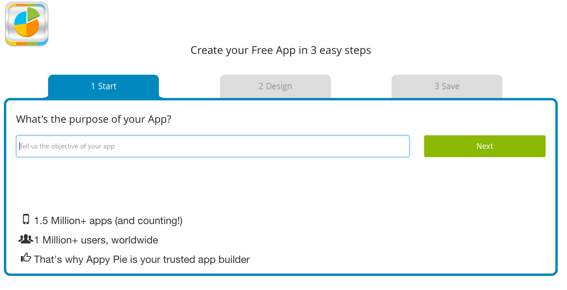
One of the first questions Apps Pie asks is on point: What’s the purpose of your app? As we’ve gone over in the past, knowing the purpose of your app is one of the most important questions to answer before doing anything else. At this point, I was hopeful.

And then came “Step 2.”

Appy Pie

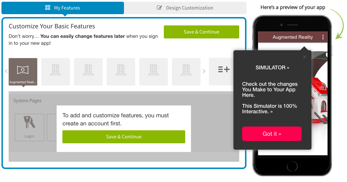
This is where it all starts to fall apart. The above screenshot is what you’re greeted with, and while Appy Pie’s UI is pretty straightforward to navigate, I found it extremely difficult to visualize what I was creating. Now, not every app developer has the same process, but a simplified overview usually looks like this:

  • Designing the UI in Sketch
  • Planning the flow in Invision
  • And then coding based upon the Invision file

Appy Pie seems to take this process and condense it into one step. While this may seem like the service has just streamlined the app building process, they’ve instead muddied the waters. There’s a lot to keep track of when planning and building an app, and one scrollable list isn’t the most efficient way to go about it.

Take, for instance, what an app’s UI design looks like in Sketch:

Sketch

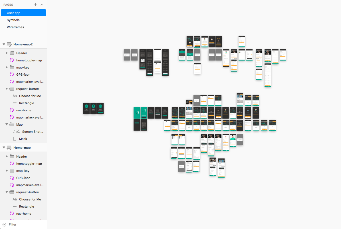
Every rectangle you see above is the design for each screen of a single app. These screens are then put into Invision and linked together to plan out the app’s flow and UX. During the design and prototyping phase, our UI/UX team gets into the nitty gritty details of each screen, working in tandem with our programmers to determine everything from screen transitions to the exact pixel dimensions for each button, field, and image.

Our developers can then take the Invision file, and code based on that – providing them with easy access to all the necessary information, from hex colors and fonts to UX and flow.

Now, imagine doing all of that, but with this UI acting as your tech doc, your design editor, your prototype, and your code:

Appy Pie

Yes, it’s visually simple. But take a look at that Sketch screenshot again. Now imagine bringing that level of detail into a system like Appy Pie’s. This system condenses the intricate and detailed process of creating feature sets, UI/UX design, and app flow into:

  • Choose feature
  • Design feature
  • Choose another feature
  • Design that feature
  • Repeat ad nauseam

This is a great way to produce an unorganized app. It’s akin to not only building a house without a blueprint – but building a fully functional and furnished kitchen with plumbing, appliances, lighting, table and cabinets, and a coat of paint – and then moving on to the living room’s wooden frame. Doing this, it’s unlikely you’ll build a structurally sound home.

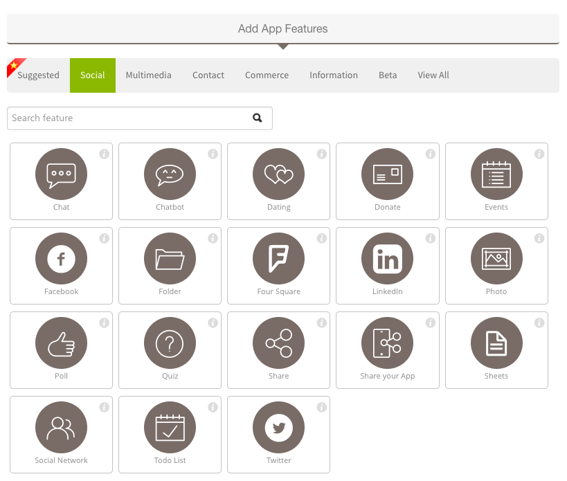
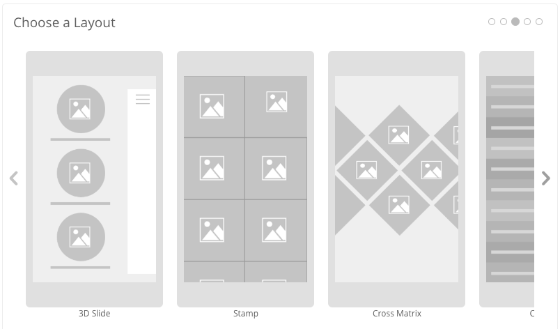
This isn’t even mentioning the cookie-cutter feel this system is sure to produce. Take a look at the options given to you for layout and design:

Appy Pie

Appy Pie

With limited options and methods of implementation, your app is bound to feel just like someone else’s.

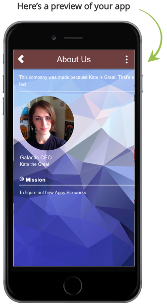
This muddied method for app creation has another negative compounding factor: You don’t know how anything fits together. Sure, “Step 2” has a live preview of each page on the right side of Appy Pie’s UI:

Appy Pie

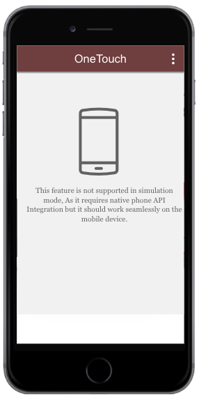
But all too often, I would be met with this message:

Appy Pie

Which brings us to development cycles. We’ve covered some dev cycles before, but overall, most developers will use what’s called agile. Basically, the steps to an agile development cycle are as follows:

  1. Identify and set goal for issue
  2. Work on issue
  3. Meet up after a set amount of time to discuss and test process on issue
  4. Iterate until complete

This process can take anywhere from a day to two weeks, and it largely depends on the developer – but (and this is a very important but) – each issue (another word for feature) is tested independently before it’s implemented. This is because (as we’ve covered in our Swift development piece) programmers will build their code in a branch, test that branch independently from the rest of the code, debug, and then merge their branch with the master branch.

This serves two very important functions: compartmentalizing bugs, and reducing the risk to the overall codebase. It’s much simpler to look over 100 lines of code and find the problem with your app than it is to look over 10,000 lines. By testing each feature by itself, developers are able to cut down on overall time spent testing the app – measure twice, cut once.

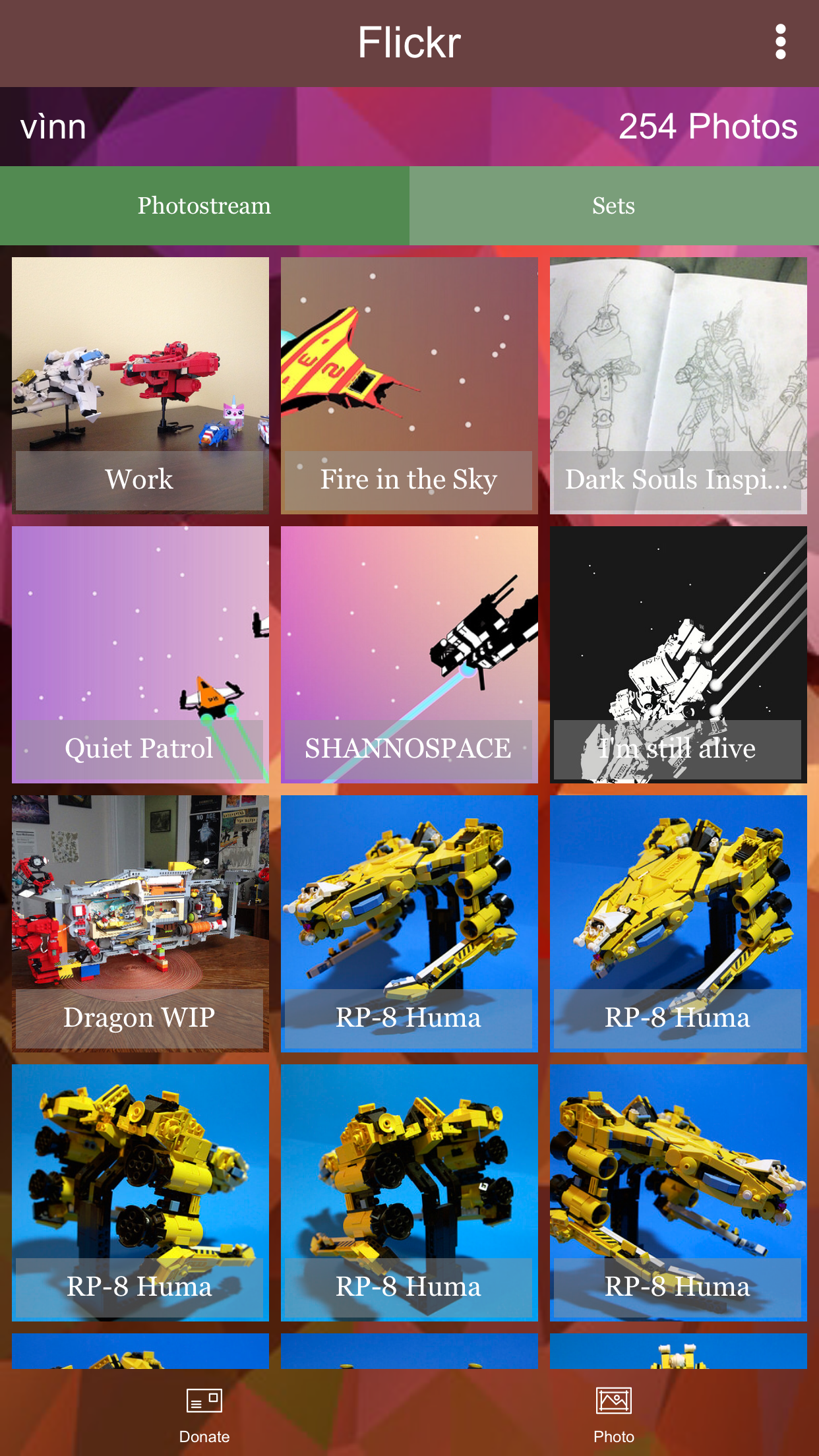
And this is where things really start to go downhill. I had made a gallery linked to my Flickr account, and I wanted to test it on a phone to see what it would actually be like to use this app on a device. So, I downloaded the app, and this is what I saw:

Appy Pie

Honestly, not bad. All the work I had to do was select the grid layout, and I had played around a bit with some of Appy Pie’s default backgrounds. The scrolling, albeit a little janky, worked, and switching between the “Donate” and “Photo” bottom menu options worked. There were a few problems though – scrolling just stopped loading new images after a certain point, and I wanted to take away the “Sets” tab, along with changing the typeface the gallery used.

So, I set those as goals to fix – much in the same way developers will test, find a bug, and fix it. I went back into Appy Pie to edit the gallery, and I was met with this:

Appy Pie

I couldn’t edit. I had downloaded the app to a device in order to test a feature set, and I couldn’t make changes (not until I paid, at least) based on my findings from testing.

How to make an app with Appy Pie: v1.1

With this newfound information, I present the fool-proof guide on how to make an app in Appy Pie “for free in 3 easy steps”:

  1. Make an Appy Pie account
  2. Design, plan, and implement your entire app all at once (perfectly too, no testing allowed)
  3. Publish your app

It’s just that easy!

When I started researching Appy Pie’s service, I really didn’t expect to end up writing something with as much snark – but my plan was forced to change. I tested an outline against my actual experience, found they didn’t work together, and then edited the outline to make it fit with what actually happened. A process Appy Pie can’t seem to replicate – for free, at least.

There’s so much more to a successful app than just making it too; ASO is a huge factor for your app’s success. For any sort of analytics, you’re paying $50 per month per app, and that app can only be stored on a maximum of 600 MB of space.

There are entire companies dedicated to analytics and building keyword campaigns for apps, and when you build an app with Appy Pie, you’re expected to do all of it yourself, while paying a platform for allowing you to do so.

If you’re a self-driven individual set on making your own app, we think that’s great. Our senior Swift developer is self-taught, and we believe some of the best coders come from the evolution of hobbyist to professional – but keep in mind, if a service’s “Create an app for free in 3 easy steps” claim seems a little too good to be true, that’s because, more than likely, it is.

Android vs. iOS – How do I decide which platform to launch on?

This is a question we covered a bit in our piece about how to find a mobile developer, but I felt like there was more to talk about; we were recently discussing in a meeting why some clients seem to favor one platform over the other, and what the benefits are to launching on iOS versus Android.

First, I think it’s important to distinguish what I mean when I say platforms – this isn’t just limited to Android and iOS, after all. There’s other facets of these OSs; AppleWatch and AppleTV; while Android is currently supported on SmartTVs and wearables like the MOTO ACTV, and is already making headway with smart glasses, home appliances, cars, and even SmartMirrors. Apple itself is of course supporting their own ventures into these new implementations of smart tech, with their own projects like Titan, for example.

But how do you decide what platform is best for your idea? Before we get into the what the future holds for Apple, Android, and all the other tech giants, let’s get a clear picture as to what the current field looks like today:

Just the facts

  • In the U.S., Android owns 54.6% of the market, and iOS owns 44.4% (Android is the top performer globally)
  • More iOS users download purchasable apps than Android users (11.82% vs. 5.76%)
  • iOS apps have a higher retention rate than Android (1% to 3% higher)
  • Android has a lower publishing cost than iOS (Android has a one-time-fee, iOS is yearly)
  • iOS development is cheaper than Android (by about 30%)

A few things to keep in mind: Android’s market share, while larger than iOS, is skewed by the fact that Android comes with many pre-paid phone options, while there are no pre-paid iPhone options. While the larger percentage of market share should indicate apps that are hosted on both Google Play and the App Store would see more total downloads from Android users, we have, in fact, witnessed the opposite.

Three apps that we have published to both the App Store and Google Play are the perfect example of this. Out of these three apps, one has an audience centered in the U.S., one is centered internationally, and one has an audience split almost evenly between the U.S. and international markets.

  • The app with users mainly from the U.S. has seen 76% of it’s downloads come from iOS users.
  • The app with mostly international users (remember, Android boasts a very high market share internationally) has seen 46% of its downloads come from iOS users.
  • The app with an even split between U.S. based and international users has seen 65% of its downloads come from iOS.

As of Q4 in 2017, Google Play hosted 3.5 million apps, while the App Store had an offering of over 2 million. Users have downloaded apps 19.2 billion times from Google Play, and 8.2 billion times from the App Store.

iPhone users tend to be younger (by only a few years, but still a noticeable difference), and are described as “power users,” meaning they engage with more categories of apps more frequently, and on a regular basis, when compared to their Android counterparts. While iPhone users are more likely to engage with apps than Android users, they also represent a smaller audience when compared to Android.

A question you should ask yourself (and this is largely dependent on what type of app you’re making) is: what is more important for my app? Reach, or engagement?

iPhone users are more likely to engage in “m-commerce” (online purchasing through their mobile device), and are also more likely to retain their position as Apple customers, as 80% of iPhone users have perviously owned another iPhone.

While iPhone users tend to favor retail and social media, Android users tend to gravitate towards (and purchase more frequently) utility and productivity apps. iPhone users tend to value simplicity and consistency, while Android users place great import on the customizable nature of their apps; likewise, iPhone users usually identify as extroverts, while Android users are mainly introverts.

These findings, of course, are not set in stone – there are most definitely introverted, low-engagement iPhone users just as there are extroverted, high-engagement Android users; some Android users exemplify the epitome of brand loyalty, while some iPhone users are disillusioned by their experiences with iOS.

But the trends are noticeable, and when deciding which platform is most important to focus on, this is data that should be considered carefully.

For more information, check out our Android and iOS dev pages.

Development options

Android vs iOS Development

As we’ve discussed previously, it’s always better to develop your app natively. This does come with one main detractor, however; cost. A great way to offset this is by focusing on one platform initially, and using the MVP model of development. We believe the best platform for an MVP is iOS, mainly due to the platform’s high user engagement. Since users are more likely to engage with, and spend more time using their apps, iOS early adopters provide higher quality feedback than Android.

In fact, one of the most successful apps on the market today, Snapchat, has mainly focused on developing their app for iOS. Now, with the benefit of a (much) larger budget, they are bringing Android up to par with their iOS version.

This is not to say that Android apps won’t work as MVPs; rather that iOS user behavior lends itself to the user engagement necessary to build a successful MVP.

The future of apps and their platforms

There’s no way to be sure what advancements in tech will look like, and predictions about the future rarely come to fruition as we expect, but there is one trend that has remained throughout the explosive growth of the internet of things; people use more, want more, and expect more.

If you’re in the ideation stage of app development, consider what you’d like to see happen. Wearables are expected to represent a $34 billion industry by next year, and right now, mainly focus on health and fitness apps. As of now, in 2019, AppleWatch is the leader of the pack when it comes to smart watches, but this could very easily change.

Android, and Google, by proxy, have cast a very wide net when it comes to exploring new avenues for devices through which to engage users, and Apple, like usual, tends to focus in on a few products to perfect.

There’s no right or wrong platform for any app, but there’s sometimes a better fit. Like any venture, it’s important to do your own market research, and plan based on your own findings. For any appreneur or CTO, the best steps you can take to build a successful app is to know your competition, know what makes your app different, and to do it better than anyone else.

How to Build a Mobile App: ASO 101

By now, you’ve probably heard the term “ASO” come up in workplace conversations, whether at a company meeting or from your office’s resident tech expert. We’ve written a few pieces about the topic already – but if you’re a CTO or appreneur that wants to brush up on the basics of ASO without digging through boring dev and publisher guides, you’ve come to the right place!

What is ASO?

It’s an idea that’s been around since the early 2010’s, but don’t be embarrassed if you don’t know too much about it – six years ago App Store Optimization was in its fledgling stage, and it wasn’t until recently that ASO became a necessity like other facets of digital marketing (social media, and SEO for example).

It’s an ever-evolving field, as Apple and Android have spent the past decade revamping and refurbishing their respective app stores – much I the same way Google has updated the parameters and functionality of SEO.

ASO, at it’s heart, is powered by keywords, just like SEO – except with a limited amount of available characters. Think of the difference between ASO and SEO like the difference between Twitter and Facebook; just as tweets must be short, quippy, and straight-forward, so too must be your ASO efforts.

The two fronts of an ASO campaign

User acquisition, and user retention, in that order. These can be broken down into sub-categories:

User acquisition:

  1. Keywords
  2. The app’s build and compatibility
  3. The app’s actual page on the App Store (you can think of this as your app’s storefront)

User retention:

  1. User reviews and ratings
  2. Time users actually engage with the app
  3. In-app purchases (if applicable)

Keywords

Keywords are the bread-and-butter of any ASO campaign. The App Store’s search option functions in largely the same manner as a search engine like Google: users input a phrase or word, and the App Store displays apps based upon relevance and ranking.

Keywords are the foundation from which to build your ASO efforts, and effectively implementing them is crucial to your app’s success on the App Store. The most important steps you can take to ensure your keywords are working for you is to:

  • Know your competition and
  • Start with 2-3 keywords (as your campaign matures, consider utilizing up to five main keywords)

Tip: Use keywords consistently throughout your app’s title, subtitle, and description. This will help you gain ground as you launch. Don’t be afraid to borrow ideas from your competitors too; if it works, it works. Research is key to your success – consider the consequences of either using the keywords your competition is using, or finding another set of keywords to focus on. Which is more likely to get you traffic? If you believe you can compete, do that. If you’re not so sure, try to catch another segment of your target audience, and slowly build up to where your app can compete with the top performers.

For more info on keyword research, check out our piece on the topic.

The app’s build and compatibility

These are considerations that you should take into account before publishing your app to the App Store – in fact, even before development begins. This is a balancing act, as increasing the number of platforms an app will run on also increases its development cost, but simultaneously increases its potential audience.

Some questions you should ask yourself are:

  • Is my app compatible with the latest devices?
  • What platforms does my app belong on? (iPhone, iPad, AppleWatch, etc.)

Tip: Another big (and often overlooked) factor is your app’s footprint on a device’s storage space. According to this study by The Manifest, 25% of mobile users have deleted an app purely based on the need for extra storage space. The smaller your app is, the less likely this is to happen.

The App Store

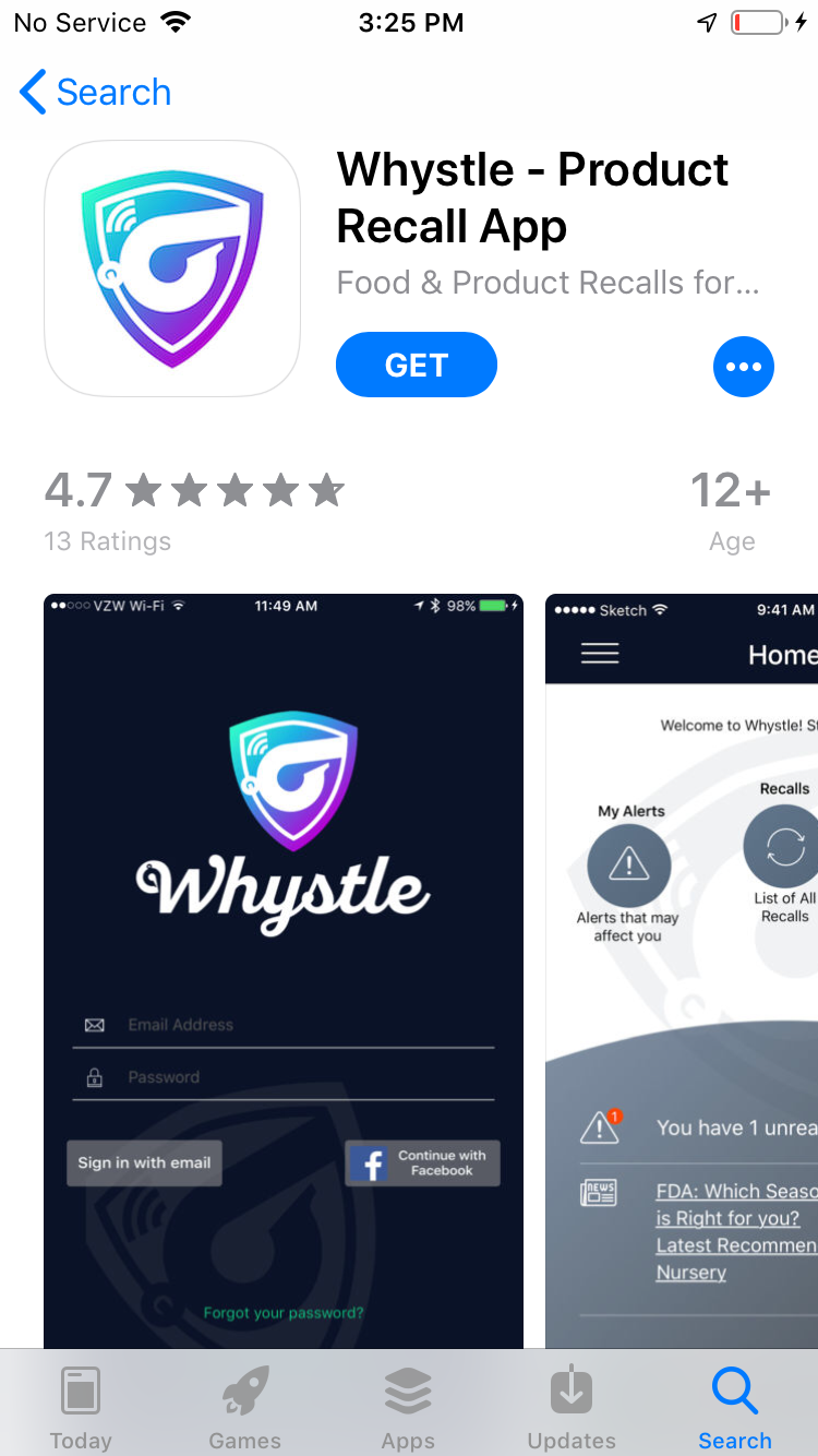
Whystle App Store Profile

Above: An example of what an app looks like on the App Store.

This is where all of your ASO efforts come to a head. Your app’s page on the App Store is powered by metadata:

  • Title (limited to 30 characters)
  • Subtitle (limited to 30 characters)
  • Promotional text (limited to 170 characters)
  • Description
  • Up to 3 preview videos
  • Up to 20 promoted in-app purchases

Your app’s icon and preview images also effect how people interact with your app on the App Store – think of these as your app’s visual branding elements.

You app’s title, subtitle, and in-app purchases rank for keywords, while your promotional text, description, and visual elements don’t rank in searches. Every section is important to your user acquisition, however – make sure you give each section its due. This is your app’s brand, storefront, and demo space all wrapped into one – any missing or underutilized section will immediately turn off users from downloading your app.

Tip: A powerful method for improving user acquisition is A/B testing. Don’t be afraid to play around with elements like your app’s icon or description – just make sure you analyze data before and after changes so you can study their impact on conversion rates. If you notice a dip in your numbers, you can always change them back. Subtitles, for instance, are a great place to capitalize on trending phrases. For more info about keeping up with trends, check out our piece written for The Manifest.

User reviews and ratings

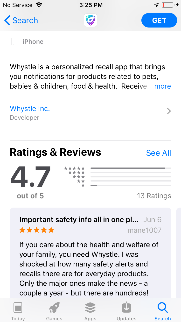
Whystle Ratings and Reviews

Above: An example of user ratings and reviews.

Your app’s user reviews and ratings are the middle ground between user acquisition and retention, as they affect (or are effected by) both. If your app has good ratings and reviews, it’ll most likely have high download numbers (or at least higher than if its ratings and reviews were mediocre), and good ratings and reviews usually stem from proper user retention practices.

Apple (and the App Store, by proxy) take your app’s rating and reviews seriously, and they have a direct effect on your app’s ranking – the better reviews and ratings you have, the better of a spot your app will receive when users search for keywords your app is ranking for

Tip: Take heed of users’ reviews, and act upon them. Use updates to your advantage – you’d be surprised at the impact listening to (and implementing) a user’s suggestions can have on your app’s retention.

Time spent engaging with your app

Just as keywords are the driving force behind your app’s user acquisition, the time users spend engaging with your app is the primary factor the App Store uses to determine your user retention. There is no set of guidelines to achieve high user retention, but some determining factors are:

  • Your app’s UI/UX (for novel ideas on how to improve user acquisition through UI/UX, check out our post on the topic.)
  • The way your app was developed (Hybrid vs. Native development)
  • The implementation of retention strategies (Push-notifications and regular updates

There are a lot of different services to help keep track of how users interact with your app (we tend to use Kumulos.) These help with determining what features your users spend the most time interacting with, how they use your app, and can also be used to track crashes, or where in your app users stop their sessions (usually due to slow load times or visual errors.)

Tip: Never underestimate the power of an update. Updates, unlike most push-notifications or requests to rate an app, promote a sense of curiosity in your users; they will be drawn to open your app to see what’s new.

The long and short of it

ASO is the culmination of directly-managed deliverables. Through proper keyword research, utilization, and implementation, good UI/UX, and strategies to engage users within your app, you can turn your ASO campaign into the driving force behind your business. Don’t be afraid to play around with your app’s page on the app store, as trending topics can lead to a surge in your conversion rates, and changes that decrease your app’s performance can always be switched back.

Good luck, and happy ASOing!

Increasing your user retention by giving them control – Our thoughts & experiences

We were sitting around the conference room yesterday, and our Senior UI/UX designer was presenting our latest build (we make a habit of getting the whole team together to look over builds before sending them off to clients). Like a lot of apps, at some point, it eventually had to ask for the users’ payment information, in order to process transactions through a payment service like Blueswipe or Stripe.

Our design team had looked into how other apps went about doing this, our main inspiration being the eponymous Uber. You can see in this video that Uber, like many apps, allows users to peruse what the app offers, and as soon as the user attempts to actually use the service, it requires them to input payment information. One main question arose during our meeting, however; just when is the optimal time to ask a user to input their credit card information?

From a business and sales standpoint, it makes sense to ask for that information right away – any salesperson dreads taking an extra step that can lead to hesitation and second-guessing during the closing of a sale, and especially loathes the idea of taking customers out of the purchasing experience – but user behavior shows a different trend.

Most mobile users are willing to download almost any app when it’s free – there’s virtually no risk (especially on iOS) on their part. But if that app asks for payment information up front, they will almost invariably delete the app.

We had experienced this first hand in the past – an app we had built was seeing about fifty downloads per day, but user retention was abysmal. We could see exactly when and where users jumped ship – as soon as the app required the user to enter a credit card before continuing to use the service.

When we played around with the app’s flow, and allowed users to look at what the app had to offer before it asked for payment information, user retention skyrocketed. The app continues to grow to this day.

It’s actually a pretty interesting facet of user psychology; even when we know a service won’t automatically charge our account, we’re all still leery of putting in financial information, even in a secure digital environment.

I even have a distinct memory of using an old pre-paid debit card to sign up for a free trial on Netflix; a service I knew I would continually use. I had no problem entering in my actual credit card’s information when the free trial period had ended, however, and to this day still subscribe to their service.

I knew I would use their service. I trusted their brand and website. Yet I still delayed entering in my information as long as possible. Why did I do that?

It’s not laziness – my real credit card was on hand – I had to dig through a desk drawer to find an old pre-paid card. Using a pre-paid card ultimately added a step to the process.

At first, sitting in the build presentation meeting, I thought I had cracked the formula for how to determine the reasoning behind a user’s unwillingness to enter their payment information: The service’s value proposition + the user’s trust in the service. I reasoned that if a user can see what a service offers, they are more likely to take the risk of entering in their credit card. After they actually use the service, they build trust in the brand, and the risk of entering in personal information slowly diminishes, until that risk eventually morphs into a reward.

This is all true, I believe, to some extent; but it still doesn’t explain my Netflix free trial experience. I had already been subscribed to Netflix for years under my family’s account – the whole reason I was making my own account was because, as an adult, it’s important to pay for your own streaming services – because, you know, that’s what adults do.

So it was back to the proverbial drawing board – and then it hit me. This isn’t actually about trust, security, or a need to know what the service will bring to the table.

It’s about control.

Asking for payment information up front doesn’t actually reduce user acquisition – it’s requiring the user to input their credit card that causes users to abandon a service or platform. Case in point, try to make a Netflix account without a credit or debit card. You can’t. But you have the option for a free trial. It’s that illusion of choice that makes the user feel like they’re in control, and consequently creates a more palatable situation.

After a pretty in-depth discussion during the meeting, we decided that asking a new user to input their payment information during the initial set up of their account wasn’t a bad thing – as long as they had the option not to.

In fact, this actually adds an element of control in the users’ eyes. The app still eventually requires the user to enter in their payment information, but it gives them the choice of when to input that data.

This doesn’t just apply to asking a user for payment information, however; it’s applicable to tutorials, user profiles, push notifications… almost any feature really.

Tutorials are an annoyance – unless you can skip it. Push notifications are bothersome – unless you requested them.

There’s a trend in UI/UX design to make everything happen in the smallest number of steps possible – which, in most situations, is overwhelmingly good practice. But perhaps, as an industry, when we consider user acquisition and retention, we should consider the power of giving users’ the ability to skip steps. To control their experience within the app. The tutorial is there for the user that wants to know all the ins-and-outs before actually using the app, and the option to skip is there to give the user more control.

This might actually be better UX than not including the extra step to begin with, because it gives the illusion of more control. What’s more satisfying for a user; no experience at all, or the option to say, “Ha ha, I don’t want to do that, so I won’t.”

It feels good to say “no” sometimes. Give the people what they want.

How to find the perfect mobile app developer

So, you’re an appreneur (or a CTO), and you want to make an app. Great! Do you already have a development partner? If yes, even better!

If you answered “no,” don’t worry. We’re going to go over everything you need to know and do to find the perfect developer, just for your specific needs.

Before you get into the trenches and start your search for a developer, it’s important to ask yourself a few questions:

  1. What do I want my app to accomplish?
  2. What platform(s) do I want my app to be on?
  3. What is my competition?
  4. What is my time table?
  5. What is my budget?

Once you can answer these questions, you’re ready to move to the next step – finding a development partner. But first, let’s delve into the reasoning behind these questions.

What do I want my app to accomplish?

This is probably the most important question you can ask yourself, as it sets the stage for all the questions that follow. You should be able to describe what your app does in no more than two sentences. For example:

I want to make an AR app that expedites the training of my technicians and assists them with diagnostics while on the job-site.

What platforms do I want my app to be on?

This question is important to ask; as development, publishing, available markets, and user behavior can (and does) vary wildly between the two main platforms, Android and iOS.

While this question is largely based upon what you want your app to accomplish, there are a few factors to consider when deciding the best answer to this question:

  • In the U.S., Android owns 54.6% of the market, and iOS owns 44.4% (Android is the clear winner globally)
  • More iOS users purchase apps than Android users (11.82% vs. 5.76%)
  • iOS apps have a higher retention rate than Android (1% to 3% higher)
  • Android has a lower publishing cost than iOS (Android has a one-time-fee, iOS is yearly)
  • iOS development is cheaper than Android (by about 30%)

For more information, check out our Android and iOS dev pages, as well as a deep look into iOS development (we’ll be going over Android development soon).

What is my competition?

Knowledge is power. Knowing what you’re up against is a huge boost for your app – while researching your competitors, you can see what works for them, tailor it to your app’s brand, and do it better. If one of your competitors has a high user rating score and good reviews, download it. Take the time to use their app, and take note of features you’d like to include in your own, as well as ways to improve upon your competitor’s flow.

If you’ve searched and found no competition, you might want to consider starting with an MVP, to capitalize on your untapped market.

What is my time table?

The answer to this question is largely dependent on what you want your app to accomplish. A simple app can take less than six months to develop from inception to launch, while a complex app can take upwards of a year.

If you want to get to market ASAP, your best bet is an MVP.

What is my budget?

Again, this is largely dependent on what you want your app to accomplish. A complex app usually costs over $500,000, and simple apps can cost less that $37,500. A few things to keep in mind before setting your budget are:

  • Each feature adds to the overall cost
  • Certain features, like backend integration or heavy graphics have a higher cost
  • Simple apps on average take 250 hours to develop, medium take 1,000, and a complex apps’ development time can take 5,000 hours.

For more information about how to formulate a budget, check out our blog post on the topic. For a personalized estimate for your own app idea, use our mobile app cost calculator.

All of these questions are necessary to answer before you speak to a developer. This will help you communicate more effectively with your developer, and they’ll be able to give you a more accurate estimate about time and cost based upon your answers.

For example, let’s say you want that AR diagnostic app to include a backend data set linked to a server so you can access system data in real time, but you only have a budget of $50,000. Your developer would be able to address these issues before making headway into the project, reducing the chance of wasted, sunken costs.

Don’t use Google to find developers

There are already companies dedicated to finding developers for you. Two sources you can trust are Clutch and The Manifest. There are a lot of sites out there that showcase development companies – but these two you can trust, as they use information from a developer’s client history, client reviews, and ability to deliver in order to determine rankings, rather than a payment hierarchy method.

If you’re already working with a developer who’s not ranked on Clutch or The Manifest, and they’re a good partner, don’t fret – personal experiences should always be weighed over site rankings. You might, however, want to tell your development partner about these sites, as they are just as beneficial for developers as they are for clients.

Using Clutch

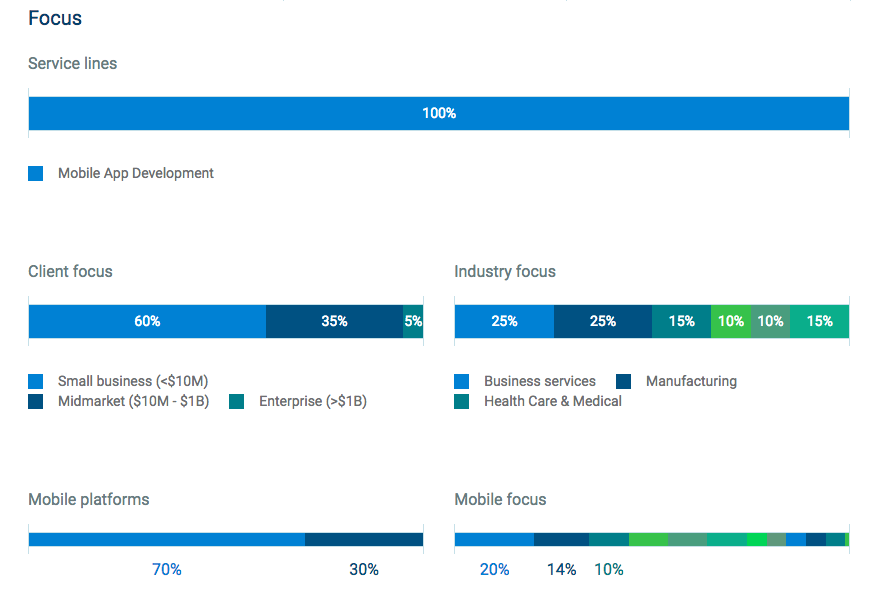
Clutch gives you the ability to find developers, set what parameters you want to use to find them (by platform, vertical, or location), and provides you with a breakdown of that developer – from client reviews to service lines, industry focus to what types of business they’ve worked with in the past.

Clutch Profile

Shown above is an example from our Clutch profile of how information is presented on the site

Clutch also hosts a blog where you can find information covering everything from B2B marketing to ASO and beyond.

A nice feature Clutch offers are badges, which developers can display on their site to show that they’re trustworthy. If you see a developer with a Clutch badge, they mean business, and you can rest assured they know what they’re doing.

Clutch Badges

Shown above is an example of our Clutch badges

Using The Manifest

The Manifest operates in largely the same manner as Clutch. The Manifest offers industry leader shortlists, and a blog (that we’ve been featured on!) hosting great thought pieces and business advice.

The Manifest listing

Like Clutch, The Manifest will offer a short bio and client history for each development firm, so you can get a feel for what each developer brings to the table.

And with that…

You’re all set! Happy hunting!

Just remember that you’re always going to have questions – and that’s okay. A good developer will either have an answer for you, or do what they can to find one. Most importantly, your personal preference and business needs should always be taken into account, and if a website is telling you x is the better choice, but you have a good feeling about y, go with your gut.

UI/UX and user retention – Strategies for success

There’s a quote from one of the founding fathers of modern architecture that perfectly describes what good UI/UX is.

Form follows function – that has been misunderstood. Form and function should be one, joined in a spiritual union.

Frank Lloyd Wright may have been speaking to the principles of good design in architecture, but his words could just as easily be used to describe robust mobile UI/UX design. I doubt the architect had ever dreamed of this quote being attributed to smartphones and mobile apps, but this idea forms a solid foundation of what good UI/UX should be.

He was speaking of the Guggenheim, but his work that most masterfully portrayed this school of thought was Falling Water. But – you may be asking yourself – what does a mid-century home in Pennsylvania have to do with UI/UX?

When a user opens your app, they should feel like they’re going home.

There is no precise, set in stone, foolproof method for ensuring your app’s UI/UX is successful – but there are steps you can take to help achieve this.

What to expect:

  • A look into the blending of UI/UX and user retention
  • Steps you can take during development to help ensure strong user retention

Minimum Viable Product

Speaking of solid foundations, its always best if your app starts with one. The easiest way to ensure this is to begin your development with an MVP (minimum viable product).

MVPs are the epitome of KISS (keep it simple, stupid) and are designed to provide the answer to your users’ pain point – and nothing else. Take a look, for example, at BrewTrader, an app we made. It’s designed to provide one function – to connect craft beer enthusiasts and provide a platform for them through which to trade brews. Each feature exists to provide a single part of the solution, and together as a whole, work synchronously to achieve the goal of craft beer switching hands.

When you are only focused on one goal, your UI inherently builds itself to achieve that goal – and with less tangential features to consider, clean and concise design will most likely come to fruition as a result.

It’s important to note that UI is directly responsible for the vast majority of your app’s UX, and is a significant factor that users will consider when they ask themselves the question; “Do I like this app?”

It might seem counter-intuitive to send out an app to market that isn’t fully complete – but as long as the inner workings are there to solve your users’ singular, crucial pain point, they’ll be pleased. A good MVPs incompleteness isn’t noticeable – and your users shouldn’t be aware they were missing something until after you add it.

As long as BrewTrader keeps the craft beer flowing, users are happy. When tangential, quality-of-life features (like user rating systems, or location services) are added later, users won’t feel like they were short-changed in the beginning – they’ll be grateful for an enhanced UX, and as such, be more likely to continue using the app.

Once your MVP is ready, you can move on to testing.

Testing

App Testing

Testing is one of the hardest steps for any developer – large testbeds are an organizational nightmare for project managers, software engineers are plagued with re-writes, and CTOs are frustrated by the inevitable technical issues that will undoubtably rear their ugly head.

But if there’s one way to ensure good UX, it’s user testing.

There isn’t much to say about this other than to just do it. Testing is used to diagnose flaws in your app – which, while not fun for the devs, is crucial to good UX.

After the first three days of a download, 77% of users have already deleted that app from their device. After 30 days, 90% of active users will have stopped using the app. The lesson here? The odds are always stacked against your app when it comes to user retention. This can be attributed to a litany of reasons, the most common culprits being slow load times, freezing/crashing, janky animations, and even taking up too much device storage.

One of the most demoralizing aspects of testing is that your testers will rarely go into detail about features and UI they liked. It’s much more difficult to express what makes up a well-designed UI than it is to criticize; but take to heart that if your UI isn’t receiving any feedback, it’s most likely because it’s already doing its job. There’s always room for improvement (as with anything in this world) but remember that an app’s UI isn’t a painting – its design should be bold enough to demand attention, simple enough to rely on your users’ intuition, and robust enough to allow additions and updates down the line.

The best way to increase your app’s chance at successfully capturing a regularly returning user base is to throughly test it. By using user stories, you can determine where the trouble spots are – and then hone in and fix the issues. There’s probably never been (and never will be) a bug-free app, but the closer you can get to a perfect app before launch, the greater your user retention numbers will be off-the-bat.

Features

Ever had your device’s keyboard lag while you’re texting? It’s disconcerting when the key you pressed doesn’t appear above your thumb, and it’s hardly noticeable when it works correctly. That’s the sign of a good feature.

A well-implemented feature doesn’t announce its presence every time it appears on a screen; it quietly enhances the user’s experience within the app. In short, your features should flow into one another.

These visual, quality-of-life features that interact with a user’s inputs are called motion design, and are a very simple way to increase your user retention, as they act as visual indicators as to what step the user is on in your app at any given time. Your users should never feel lost – they should feel at home – and one of the easiest ways to provide that comfort is with motion design.

A feature should always serve to enhance the solution to your users’ pain point, so when determining your app’s tech stack, consider; “Does this help my users?”

If it does, great! If it doesn’t, it’s time to go back to the drawing board. There aren’t many features that are directly responsible for increasing user retention (other than push notifications, which 60% of iPhone users disable anyway), but they rather act as a whole to present a polished, useful package for your users.

Don’t be worried if your app isn’t making use of every feature available – if your app doesn’t need location services, for example, it will function better without it. App bloat is real, and less is more.

The most important step you can take when it comes to increasing user retention through features is to make sure each feature works perfectly, and flows into the next.

Updates

Updating your app frequently serves three important purposes:

  • It reminds your users that your app exists
  • It keeps your app’s security up to date
  • It shows your users that you care, and are invested in improving their experiences

Updates are, I would argue, a more effective call-to-action than push notifications. Not only does the notification to update your app serve the same purpose of reminding a user to open your app, it implicitly tells your users there is either something new, or something has been improved.

Keeping your users personal information secure is a no-brainer – any user that notices their information has been compromised by your app will undoubtedly stop using your app and delete it. A large chunk of app conversions come from word-of-mouth; and dissatisfied customers are much more likely to complain about your app than a happy user is to praise it. Never underestimate how damaging a low user review or score can be on your app’s rank within the App Store or Google Play.

Updates that improve your app’s UI, or fix bugs, show your users that you care about their experience. People like feeling cared for – just think about the difference between eating at a fast-food restaurant and dining at a sit-down eatery. We even have different words to describe these culinary experiences – “eating” versus “dining.”

Start with an app that gives your users an experience to dine on, rather than just eat. Then, update it frequently to ensure your menu is consistently fresh and robust.

Users are fickle, until they’re not

There doesn’t seem to be much middle-ground here; if a user hasn’t deleted your app, they’ll either open it once a month, or make it part of their daily lives. In fact, the average mobile user in the US will spend 90% of their time using their top five apps.

There is no set of rules for ensuring high user retention numbers, but clean and responsive UI, through testing, synchronous features, and pertinent updates will greatly increase your app’s chances of success.