Out-of-the-box tools you can use to make a targeted ASO campaign

A trend we see a lot in this industry are great ideas with no legs. Sometimes it’s for the usual reasons – lack of monetary investment, insufficient market research, or a belief that anything is possible with tech – but all too often, the hurdle that’s most difficult to cross for an appreneur (or even a large company for that matter) is planning how their app will succeed once it’s on the App Store or Google Play.

What to expect:

  • A quick look into how and why combining ASO with SEO campaigns is a strategy for success and efficiency
  • An instructional tour of SEO tools Answer the Public and Keywords Everywhere, and how to merge these into your ASO campaigns

Plan your ASO now

The app store is a big and scary place for a fledgling app – and it’s all too easy for your great idea to drown in the seas of the App Store and Google Play. ASO (App Store Optimization) is not only your app’s lifeline, however – it’s the vehicle for your app’s growth. Your ASO efforts should constantly evolve with trends in the marketplace – but setting a solid foundation before your app is launched can save you the trouble of future headaches.

While still relatively new, ASO is as important to your app’s success as SEO is to your website’s, (to be fair, SEO is still new when compared to traditional marketing channels) and should be treated with the same care as your company’s brand. ASO, in fact, is your branding and the channel simultaneously.

I like to think of the App Store or Google Play like a giant mall – stores in a mall use signage to draw in customers, and then provide a unique experience for shoppers while they’re in the store. ASO works in pretty much the same manner – apps use keywords and their icon to entice users to look at their page on the App Store, and the page itself serves to provide those users with a unique look into what their app offers, and how it can help them solve a particular pain point.

That’s the driving force behind every app – a pain point. It’s almost too simple to look at apps everyone knows about and determine the pain point they were created to solve; Uber wanted to give users the ability to hail a cab without waiting for one to find them first, AirBnB gave travelers a network to find affordable accommodations in expensive areas, and WhatsApp was made to serve as an all-in-one communications channel for voice, video, text, and almost any form of media under the sun.

All of these apps have grown in scope and functionality, but their adherence to providing a specific solution to their original pain point remains, undoubtably due to their market research. The market research findings that dictate the pain point your app focuses on should also dictate what your ASO focuses on.

This is why when you’re conducting your own market research, and you’re entrenched in campaign ideation, it’s the perfect time to plan your ASO. You can then directly utilize your market research findings and implement them into your ASO campaign. There are plenty of ways to do this, such as classic market research tools like focus groups or surveys, but there are a lot of online services that can help jumpstart your ASO campaign, and provide insight into your customer profile. We’ll cover two:

  • Answer the Public – This is an SEO tool first, and an ASO tool second. Luckily, what works for one usually works for the other.
  • Keywords Everywhere – This is used to provide insight into specific keywords’ value and competition. Again, this is an SEO tool, but it’s just as valuable for ASO.

So how do SEO tools help my ASO campaign?

Ever since the advent of Google, the idea of searching has morphed into “Googling,” and people tend to use the search function of any site or service in much the same way as they would Google.

According to MOZ’s Beginner’s Guide to SEO, (the best SEO resource out there) people use the search function in three main ways:

  • To do something – A user would search “buy hiking shoes” to find different options of hiking shoes to purchase.
  • To learn something – A user would search “what are the best hiking shoes” to find out what hikers are saying about different brands.
  • To go somewhere – A user would search “Made-up Brand hiking shoes” to go directly to an online store.

People on the App Store or Google Play largely use the app store’s search function in the same way. Searches on the App Store and Google Play generally fall into the “do something” and “go somewhere” categories.

According to Statista, while the largest channel for app discovery is through the search function of the App Store and Google Play, more apps are discovered from channels outside of the App Store and Google Play. These channels (ordered from highest percentage of discovery to lowest) include:

  • Friends and family
  • Social Media
  • News, reviews, and shows
  • Websites
  • Web Ads
  • Traditional Ads

All in all, those six channels account for 58% of all app discovery, and out of those six, five are influenced by SEO.

Answer the Public

So, let’s say you’re working on an app that sells hiking shoes. In order to find out what people are searching for when it comes to hiking shoes, it’s best to start with Answer the Public.

To begin, simply start by typing in a phrase (it’s best to start with generic, non-specific phrases). In this case, the phrase “hiking shoes” was used.

Answer the Public example

Answer the Public will break down that phrase into five categories:

  • Questions associated with the phrase – e.g. “Which hiking shoes to buy?”
  • Prepositions associated with the phrase – e.g. “Hiking shoes for kids”
  • Comparisons associated with the phrase – e.g. “Hiking shoes vs. trail running shoes”
  • Alphabetical listings of words added to the phrase – e.g. “Hiking shoes Amazon” and “Hiking shoes black Friday”
  • Popular related searches – e.g. “Hiking shoes near me” or “Hiking shoes for sale”

This is a great tool to not only help your SEO keyword ideation, but also your ASO. While you add keywords to your website, (a channel that accounts for 10% of app discovery) add those same keywords to your app’s page on the App Store and Google Play. If people are searching for “Hiking shoes” on Google, they’re most likely searching for the same thing on the App Store.

You can use Answer the Public to stay in the know about what people are searching – and continuously update your keywords to reflect those searches. Unlike SEO, however, ASO should be limited to five keyword phrases (which should repeat throughout your app’s title, subtitle, and description for maximum effect) so keep that in mind when updating your page on the App Store. For example, our hiking shoe app would most likely always include the keyword phrase “Hiking shoes for sale,” as that’s the app’s main purpose; other keywords can be implemented and switched to capitalize market trends.

Keeping up with search trends is a powerful tool for maximizing your app’s success. For instance, more people hike in the summer, so adding key phrases such as “summer sale,” or capitalizing on nature-centric holidays like Earth Day with phrases like “Earth Day sale” can bring temporary but powerful boosts to the amount searches your app will appear in. By continuously using services like Answer the Public, and updating your keywords to reflect current trends, these temporary boots can become your norm.

Keywords Everywhere

An add-on for Google Chrome, Keywords Everywhere is easy-to-use, free, and tremendously helpful. When paired with Answer the Public, this tool really begins to shine.

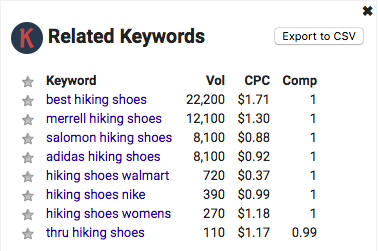
This add-on will automatically detect keywords and display the monthly search rate, cost per click, and competition for each keyword. When paired with Answer the public, it looks like this:

Keywords Everywhere example

And when used with a Google Search, looks like this:
Keywords Everywhere example

Working from the above example, let’s look at “best hiking shoes” versus “hiking shoes womens.”

“Best hiking shoes” was searched 22,200 times in January globally, its cost per click (CPC) is $1.71, and its competition is 1 (very high).

“Hiking shoes womens” was searched for 270 times in January globally, its CPC is $1.18, and its competition is 1 (very high).

By comparing the two, we’re able to glimpse some important trends:

  • “Best hiking shoes” is about 82 times more popular than “hiking shoes womens”
  • While both searches are highly competitive, “best hiking shoes” fits into category 2 of types of searches: To learn something. “Hiking shoes womens” fits into category 1 of types of searches: To do something. Due to this, “hiking shoes womens” is the more valuable key phrase.

So why is “hiking shoes womens” the better option? Intent.

Someone searching for “best hiking shoes” probably isn’t looking to purchase anything (at least immediately) – they’re most likely conducting their own research into what brand of hiking shoes would be their best option. While it’s a popular search on Google, the number of conversions that directly come from “best hiking shoes” is most likely low. There is, however, great value in a key phrase like ”hiking shoes womens,” as someone searching this key phrase isn’t asking a question, or searching for more information – they’re looking for a store from which to buy hiking shoes for women.

This knowledge can then be transferred and utilized with both your SEO and ASO campaigns.

Both of these key phrases would be good for our hiking shoes app’s ASO; “best hiking shoes” because it is searched so frequently, and “hiking shoes womens” because people searching this phrase already know they want an app that sells women’s hiking shoes. With such high competition for both of these keywords, however, it would be pertinent to add in keywords with lower competition, such as:

Keywords Everywhere example

This key phrase shows two very promising factors:

  • While the volume of searches is low, every search is implicitly describing the intent to purchase hiking shoes
  • It has low competition, so the low volume of monthly searches is balanced with a more accessible playing field

All in all, it’s a balancing game between finding keywords that are searched for regularly, and making sure the competition you’re facing is accessible.

ASO early, ASO often

While it always helps to come out strong with your ASO campaign, it’s never too late to start. These tools are free for anyone to use, and can provide great insight into both your SEO and ASO efforts. By pairing your SEO and ASO, you can more effectively target and capture audiences, and create conversions from clicks.

iOS Development and Swift Code – What you need to know

Everyone knows the two major players on the mobile platform market – Apple and Android – but what makes these platforms tick?

If you’re an iPhone user, your phone runs on iOS, which utilizes the programming language Swift. Swift was released in October of 2014, and is currently in its fourth iteration, aptly named Swift4. As our third installment of How to Build a Mobile App: the Ultimate Guide, we’ll go over what you need to know in order to make informed decisions about iOS development, and key terminology that will help you better communicate with (and understand) Swift developers.

Disclaimer: If you’re a developer or software engineer, there might not be any new information for you to find here. For a more in-depth discussion about app development, check out our addition to the native vs. hybrid debate.

If you’re a CFO, business developer, or appreneur who’s trying to figure out what a software engineer is talking about when they say “back-end integration,” or want to know just what exactly is an API, you’ve come to the right place.

As of June 2018, iOS accounts for 44.5% of the worldwide mobile market – a growth of 15% since January of 2012. In the US, iOS boasted a market share of 63% in 2018. With over 2.1 million apps on the App Store, Swift can be used to create programs on all of Apple’s platforms – iOS, macOS, watchOS, and tvOS.

Swift is based on and emulates the functionality of the C family of programming languages, including Objective C and C++, with an open source community of developers at swift.org. Swift’s open source code is hosted on Github, an online community of over 28 million developers for hosting and reviewing code.

Due to the open source nature of Swift, the Swift community has compiled libraries to share with other developers. These libraries are resources of generic, useful code that can run on all platforms supported by Swift, and include character sets, support for dates and times, interaction with the file system, and many more functionalities. Swift comes with a default library, but these extended libraries, named the Swift Core Libraries, are continuously updated by the open source Swift community – allowing developers to utilize the newest innovations in Swift code (without writing it themselves). This code can then be customized to fit any need.

Swift can also be used on a Linux distro to build both libraries and applications, and the open source community is currently working together to bring Swift to other computer platforms.

The tools available to developers

While coding, Swift developers use XCode to write, and can use playgrounds to view their code’s outcome in real time. While working collaboratively, developers will use organizational tools such as beanstalk, which are used to keep track of code and current projects. These organizational tools are especially important when collaborating on a project, as any difference in a line of code between two workspaces will result in a merge conflict. When this happens, both lines of code must be compared in order to identify the merge conflict, adding extra time to the debugging process.

Coding best practices dictate it’s always better for a software engineer to work in an isolated branch to avoid merge conflicts altogether.

Developers can use a git client such as Sourcetree to check code in and out of collaborative databases. Think of it like Google Drive – it’s a shared workspace for multiple developers to remotely access code from the same database.

The Swift process

Android Pie and iPhone 12.1.2

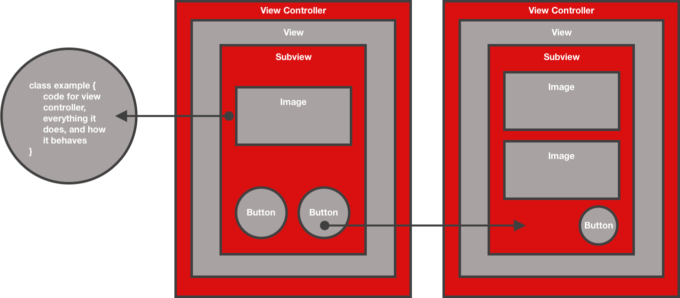
The overarching structure of a simplistic app designed in Swift is:

  • View Controller – Think of this as the frame of a painting. The view controller, which is aptly named, controls what you see on the screen of your mobile device.
  • View – Within the view controller is the view. Think of this as the canvas of a painting – the view makes up the sum of all visual aspects of the app. Each screen of an app is a different view.
  • Subview – Subviews are the individual sections that collectively make up the view. Think of a subview as specific sections of a painting, such as how the subject matter is distinguishable from the background. More specifically, a subview would be the keyboard section of iMessage, or the section where text messages display.
  • Buttons – Buttons are… well, buttons. Within subviews, buttons are the interactive elements of apps. Think of the individual letters of the keyboard section of iMessage.
  • Images – Also within subviews, images are used to display specific pieces of visual information, and range from photos to logos and icons. An image can function as a button.

In order to do this, developers:

  • Start with building the basic UI (user interface)
  • Connect the UI to their code
  • Work within the view controllers (different screens will have different views)
  • Define the data model (the structure of information in the app)

First, a software engineer will layout the screens of an app in a storyboard. This acts as the roadmap for what the completed app should look like, and individual elements on the screen are then connected to code. These elements are referred to as classes, and the code inside these classes controls everything that element does, and how it behaves. For example, a class could be set to darken whenever an element is interacted with by the user, or set to cycle through images at specific time intervals. Classes can be coded to act in almost any way the software engineer can imagine. As classes are built, the UI is connected to the code.

Next, the de-bugging process starts. This is where pull requests come into play. When individual software engineers write code, they work on a branch (a section of the apps’ code) separate from the master branch, in order to minimize the risk of depleting the robustness of the app’s original code. Before implementing the code they are working on into the master branch, a software engineer will make a pull request based on their individual branch versus the master branch. This pull request is in essence a review process – having a second pair of eyes look over code is a great way to catch bugs before they are implemented. The branch is tested, and after its final iteration, is implemented into the master branch.

Developers will repeat this process for every view controller until the app is completed.

The next step in development is beta testing, which we will cover in detail later down the road. After the app is thoroughly tested, the app is submitted to the App Store for review by Apple. During this step, you set your app’s availability (what regions it is available for purchase in) and pricing, and then after approval from Apple, the app goes to the marketplace.

Adding an app to the App Store costs $99 per year, and Apple keeps 30% of each sale. For more information about how much it costs to build an app, check out our blog post on this topic.

Down the line, we’ll go over Android development, so if you’re looking forward to that, don’t worry.

Glossary of developer jargon:

  • Adaptive interface: An app that adapts to the available screen resolution. Essentially the same idea as a responsive web page.
  • API: An Application Programming Interface is a set of functions, classes, and protocols that define how pieces of software interact with each other. They facilitate code creation by providing tools and building blocks that help companies connect their software with another set of software, or even other companies’ code.
  • API calls: Sometimes referred to as an API request, an API call is essentially a piece of software in an app connecting to a server, and requesting a data transfer.
  • Back end development: This forms the logic and data structure of the app.
  • Back end integration: This allows an enterprise system to connect to an app – for example, connecting the database of a website to an app, in order for users to access the database through the app rather than the website. The information is hosted on the website’s server, but is still accessible through the app itself.
  • Control: This is a type of view that responds to a user’s input, like our example of a button turning dark after interaction.
  • Enumeration: Referred to by developers as “enums,” an enumeration defines a common type for a group of related values, and allows you to work on these values in a safe way within the code.
  • Front end: This is the layer of the app that users interact with.
  • Adaptive interface: An app that adapts to the available screen resolution. Essentially the same idea as a responsive web page.
  • Function: A function is a reusable (and named) piece of code that can be referenced from many places in a program.
  • Iterate: To perform a certain task or function repeatedly.
  • Method: Like a function, a method is a reusable, named piece of code that’s associated with a particular class, structure, or enumeration.
  • On demand app: These are apps that allow users to find, connect with, and book a professional service.
  • SDK: A Software Development Kit is a pre-made software tool that can be used for a variety of functions. Some SDKs help with analytics, others provide debugging and maintenance utilities, and a whole host of other functions.
  • Structure: When written in Swift, structures are designated by the keyword “struct.” Structs allow developers to store data in the form of properties and functions.
  • Tokens: A token is a software based security tag that produces a single-use login password or PIN.
  • UI/UX: User Interface and User Experience are intrinsically tied to each other. UI is the layout and design of the front end of an app. UX is how the app flows, functions, and responds to the user’s inputs.

AR – It’s time to start thinking about it

There seem to be new technologies and trends emerging every day as the internet of things grows to envelop and shape the way we interact with each other, our jobs, and our hobbies. Today, one of these hot-topic-pieces-of-tech is augmented reality (AR).

With the release of Apple’s ARKit in June 2017, and Android’s ARCore in March 2018, mobile developers now have the tools to natively develop AR apps for smartphones, wearables, and even cars. If you’re a business that isn’t in the industry of user-facing software and products like Google or Snapchat, it might be easy to overlook the value of implementing AR into your daily procedures, or difficult to determine just how AR would work for you and your company.

Before we get into how your company can implement AR into its business model, let’s go over why AR (despite being a relatively new and untested technology) is probably the most exciting field of innovation for consumers and business alike.

In October of 2001, it was difficult to imagine that the iPod would completely revolutionize the technological landscape. We’d seen the evolution from records to cassettes and 8-tracks, to CDs and Walkmans – but all that had changed was the size and mobility of the music player – listeners still interacted with their devices using play, skip, stop, etc. It wasn’t until the iPod came to the market that a device changed the way listeners interacted with their music – suddenly, you didn’t need a backpack to carry your CDs, and track titles were visually displayed in searchable lists. The planning required by an individual to take music on the go was replaced with the ease of picking up a device with all of your favorite songs on it, and simply putting it in your pocket. This led to a drastic shift in the way people thought of their interactions with their music players – you listen to a Walkman, but you use an iPod.

We all know what came next – the largest shake-up the music industry had seen since the switch from analogue to digital recording – and like any significant change to a market, there were growing pains aplenty as artists and producers alike adapted to the changing climate.

It’s a trend that has continued rapidly ever since, as advancements in technology revolutionize every industry imaginable. In 2007, when the iPhone was first introduced, people stopped talking on their phones, and started using them. A year later, Android phones were on the market, and soon enough, smartphones evolved from a trend-setter status-symbol to ubiquitous multi-tools used to enhance almost every aspect of our daily lives. It took only six years to go from a device that holds 1000 songs to smartphones that put Captain Kirk’s communicator to shame.

Well, it’s 2001 all over again; except this time, it’s not music – it’s augmented reality.

Training and quality control

Imagine hiring a new HVAC technician. For that new hire to be successful, they must be trained, which means another technician is either pulled from their current job, or given the extra responsibility of teaching while also working. This is the way skilled trade knowledge has been passed down from expert to apprentice since the dawn of time, but it lacks the efficiency AR provides.

With an AR enhanced training program, that new technician can learn the ins and outs of HVAC systems on their own, without receiving instructions from an experienced employee – greatly increasing productivity and reducing the total cost of the hiring process. New employees are not only trained on their own – they are also trained more effectively, as AR ensures each training session disseminates the correct information and processes every time.

AR allows that new technician to see every layer and part of the HVAC system – from individual screws to the entire ventilation structure – and how each piece fits together. Your trainee can experience every possible type of mechanical failure for the system, and learn the appropriate remedy at their own pace.

Imagine being able to provide real, on-the-job experience without ever risking inefficiency or error at an actual job site; with AR, a technician can become an expert without ever going into the field.

When it comes to manufacturing, AR is the ultimate quality control assistant. Manufacturing jobs such as those on automobile production lines require high levels of accuracy, utilize a staggering number of parts, and rely on step by step processes that can easily be forgotten or implemented in the wrong order – especially during a long shift.

AR can, in real-time, highlight the next step in the assembly process, show where and how the parts are implemented, and check for accuracy after the step has been completed.

To see how this works, check out this amazing AR system by SCS Concept Group, VPG+.

Efficiency

Industries that utilize automated equipment, such as manufacturing or mining operations, can easily be enhanced with AR diagnostic systems. A fun project we did for Luckstone (one of the largest family-owned and operated producers of crushed stone, sand, and gravel in the U.S.) was an AR app that enhanced the productivity of quarry operations by providing the foreman with an interface that allowed on-site remote data analysis in real-time. The user points their mobile device at an operating machine, and a tag is displayed on the device’s screen – that tag can be expanded, providing real-time data on pounds of stone moved, operating efficiency, and any other data point relevant to the operations of the machine.

This saves foremen the wasted time of either walking across the quarry to the specific machine, or leaving the job site to analyze data in their office. This system was adapted to their business development team’s needs, and we developed an app that gave sales representatives the ability to access cloud data on past, current, and prospective clients based on geo location.

The sales representative points their phone towards a business, and in real time, information on past interactions with that customer is displayed on their device, giving them the ability to research potential clients, follow up on leads, and ensure they don’t mistakingly visit the same business twice, all in real time.

AR may be new, but it may just be the next big thing

It was only in 2017 when Apple released ARKit, after all; but AR is already making waves in the mobile industry. In 2018, Snapchat, which heavily invests in AR technology, posted a net worth of $3.2 billion. With leaps in advancement with wearable technology, and the integration of smart technologies in cars, it wouldn’t be surprising for AR to become commonplace in our daily lives in the coming years. It might even come to be expected by users – in 2006, if someone had told Jack Dorsey that Twitter would help decide the 2016 presidential election, he’d probably have laughed – but a social media startup became so integral to the way we communicate our ideas that it did just that.

We’re right at the cusp before the AR industry begins a rapid period of growth, so now is the time to start planning just how to implement AR into your own business’ needs.

How to Build a Mobile App: Native vs. Hybrid Development

Every business and entrepreneur wants to push their product to market with the smallest investment of time and capital as possible, and for good reason. It makes sense as an appreneur to seek out the method of mobile development with the lowest cost, which is usually hybrid app development.

In our second installment of How to Build a Mobile App: The Ultimate Guide, we’ll look into the pros and cons of both hybrid and native app development, and shed light on why when examining the entire lifecycle of an app, we believe native is the more cost effective choice.

It is important to note that this is a topic of debate with a wide and varied array of opinions and conclusions. Throughout my research on the native vs. hybrid debate, the overwhelming consensus is that “it depends on the developer.”

Developers and blogs are quick to espouse the pros and cons of native and hybrid apps that the tech industry has agreed upon, but there seems to be little supporting evidence as to where these findings originated, other than from their own personal experience. Articles, thought-pieces, and blogs have all come to contradicting conclusions based upon the same sets of data, and these conclusions seem to arise from the opinions and skillsets of the developers or authors themselves.

Regardless of any opinion about native and hybrid development, the most important step you can take as an appreneur or business is to work with a developer you trust – but it is important to know how each method of development can influence your app’s future.

This is a debate that seems to be mainly fueled by opinions rather than stats – but we will provide as much insight as possible by using what case studies and supporting data are out there.

There are many different lenses from which to view this debate, but we will mainly focus on answering these questions:

  • What is hybrid development?
  • What is native development?
  • What do they mean for your users?
  • What do they mean for your business?

What is hybrid development?

Hybrid development follows the naming convention of most dev terms, and does exactly as its title implies; it utilizes a software development kit (SDK) to make an app that can run on multiple platforms (Android and iOS, for example) and is coded using HTML, CSS, and JavaScript – as well as others.

A hybrid app’s code is passed through a “wrapper” that the OS can understand – like an English speaker using a phone to translate a conversation with a Spanish speaker. Hybrid apps rely on plugins to access your device’s functionality – such as the device’s native hardware, camera, mapping, messaging, and email functionalities. Plugins are built and supported by third parties, and a hybrid developer doesn’t have control over how a plugin functions – only when and where it is implemented.

In a similar vein, a progressive web app (a hot topic right now) uses the device’s native browser to access a website specifically designed to display information on a mobile device. It’s akin to clicking a hyperlink, but instead of taking you to a link, it takes you to the site where the app is hosted. The app isn’t visually displaying the browser layer, but uses the device’s browser as a way to connect the device to the app.

Relatively new to the development scene is React Native, which allows developers to code an app using the same UI (User Interface) blocks as a native app, but written in JavaScript and React. It’s basically a hybrid of native and hybrid development, giving developers the opportunity to mix web-based languages with their native counterparts – and provides developers with the option to use JavaScript and React for simple processes, and the device’s native code for heavy lifting and pages that must be tight and responsive.

What is native development?

Just like hybrid, native development’s name describes its exact method of app creation; apps are coded using languages native to a specific platform, such as using Swift to write for iOS, or JAVA for Android.

Native apps can seamlessly integrate with the native functionality on your device – this gives native developers the opportunity to focus on designing the main aspects of your app, rather than spending time working with third party plugins to achieve the same functionalities already included on your users’ device. Native apps are also more secure than hybrid.

What do they mean for your users?

Your users honestly don’t care if your app is built using hybrid, native, progressive, or React Native development. They care about solving their pain point – and how well your app solves that problem. Whether it’s Snapchat (a natively-developed app with a focus on iOS) solving the dearth of filtered selfies, or an HVAC engineer using an augmented reality (AR) app to run diagnostics on a broken system, your users care about how responsive your app is to their inputs, the intuitiveness of its UI, and the quality of the solution it provides.

Users want your app to feel like it belongs on their device; they don’t want to be forced to learn how to use your app. They want your app to work for them, and the easiest way to ensure your users are provided with an intuitive UX (user experience) is to natively develop your app.

When it comes to UX/UI, natively-developed apps will almost invariably perform better than hybrid. Native apps are not only coded for a specific platform; they provide a UI that is designed to the standards and conventions of that platform. To put it simply; using an iPhone feels completely different than using a Samsung. They both display interactive information across a touchscreen; and for a user, that’s just about where their similarities come to an end.

Over time, Android and iOS users have come to expect certain commands to perform specific functions, and both platforms rely on their users to interact with apps using different sets of intuition. Both platforms have released style guides for developers to follow, which can vary significantly in their principles of design and function.

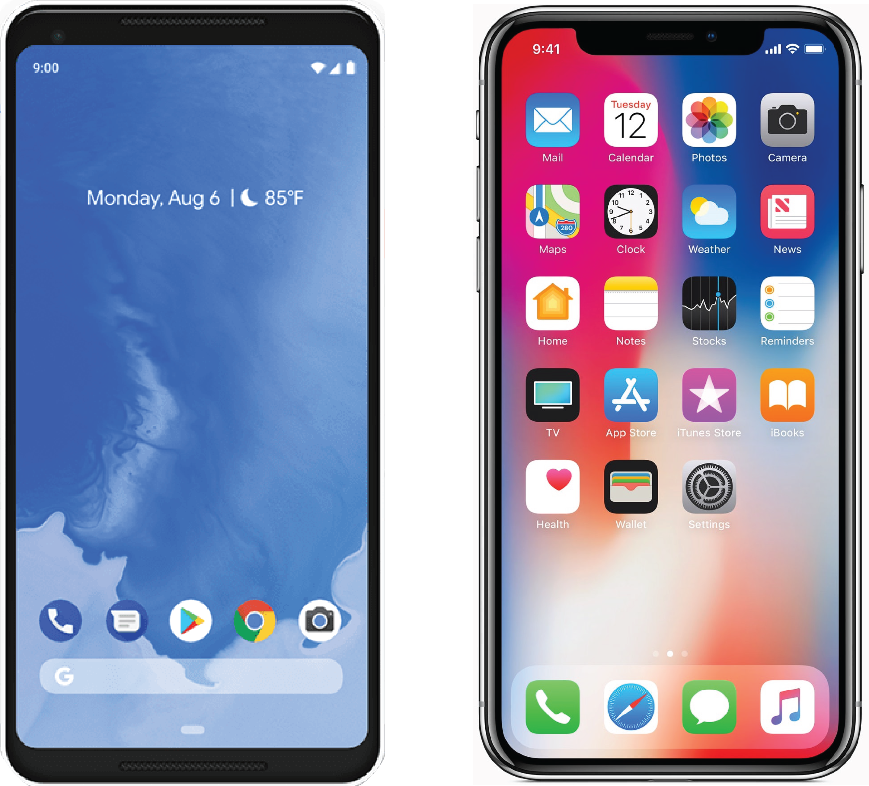
Take, for example, the difference between the home screens of Android Pie and an iPhone X:

Android Pie and iPhone 12.1.2

Above (left to right): Android Pie, and an iPhone X running iOS 12.1.2

Have you ever borrowed a friend or colleague’s phone, only to be presented with an unfamiliar UI? It’s a jarring experience, and it’s an excellent example of the personal connection we share with our phones and other mobile devices.

Android users will intuitively search for the “hamburger” (three horizontal lines stacked on top of each other) style menu to access information, while iPhone users will expect bottom menu bar navigation. It seems pretty straight-forward to adapt to either system, but users quickly form strong opinions based on their first interactions with an app, and users are more likely to uninstall your app than keep it. Within the first 3 days of an app being downloaded, 77% of the users who downloaded it have already uninstalled.

An important thing to keep in mind is that your app is not the only one on a user’s device. There are most likely apps competing for your users’ attention, and those users are liable to switch to another app at any time – especially if it doesn’t provide the best experience possible. According to Dynatrace, a software intelligence company, 48% of users are less likely to continue using your app after a negative experience, 31% are less likely to purchase another app made by your company – and will spread negative word-of-mouth marketing to their friends – and 26% will give your app a negative rating.

This is why your development method matters to your users. An app with a hybrid design will run on both platforms – but it won’t run as well as a native app. A hybrid app will always be forced to sacrifice the aspects of the user experience that make each platform unique; and because of this, your app will feel less personal – and mobile’s strongest attractor is the personal experience it provides.

If your app isn’t responsive, and doesn’t flow seamlessly with the rest of the UI/UX a platform offers, users will grow frustrated – which can lead to them switching to a competitor, or giving your app a bad rating or review.

What do they mean for your business?

Simply put, hybrid development will almost invariably have a lower initial cost and faster development time when compared to native. This is for two main reasons: There is no extra cost to write code that runs on multiple platforms, and they are written using languages web developers already know.

This means that when developing for multiple platforms, hybrid development takes roughly half the time of native, and opens access to two markets for the cost of one. This method of development usually comes with a lower billable rate, as web developers make about 20% less than mobile developers and spend less time coding and testing (initially), as the app runs on every platform using the same code.

These factors indicate hybrid development has both a lower initial investment and opportunity cost when compared to native, and are extremely compelling reasons to choose hybrid over native; but the lower up-front cost and doubled market size are traps that can lead to issues down the line that can severely hamper your app’s growth and sustainability.

It was in 2012 when Facebook CEO and tech giant Mark Zuckerberg was quoted saying “the biggest mistake that we made as a company is betting too much on HTML5 as opposed to native,” in an interview with TechCrunch. “[I]t just wasn’t there,” he continued. “[S]ince we’ve done the iOS app we’ve seen double the amount of feeds people consume.”

The social media company had many reasons for switching to native development, which were presented in a post detailing the performance issues and limitations Facebook encountered with HTML5. Some of these performance issues include:

  • Lagging scrolling speeds
  • Janky animations
  • The overload of data in the feed would sometimes cause the app to crash

These were issues Facebook deemed important enough to spend the time and money on developing their app natively, and is a perfect example that no matter how large your market presence is, your UX is crucial to your app’s continued growth and success.

A hybrid app may have a lower initial cost than a natively-developed one – but a native app will provide a better experience, and only the best apps perform well on the App Store and Google Play. In 2016, the top 200 apps on the App Store had an average of $82,500 in daily revenue, while the top 8,000 apps had an average daily revenue of just $3,500, a stark decline that demonstrates the need to be the absolute best at providing the solution to whatever pain point your app aims to solve.

As another example, in 2016, AirBnB took a leap of faith and began development using React Native, a switch from their native development roots. Ultimately, AirBnB decided to switch back to native development for many reasons, including:

  • There were technical and organizational issues with React Native that hampered development, causing unexpected delays on projects that could easily have been completed using native code.
  • It turned out that while their app was created using React Native, only a small portion of the app was truly coded using React. In order to work effectively, bridging infrastructure was required, and the engineers were forced to add to their work load by supporting code on three platforms instead of two.
  • While build time iterations were an order of magnitude faster than native, debugging could take days.

When comparing the cost of developing an app for both iOS and Android, native development will always be more expensive than hybrid, as code must be written separately for each platform, leading to more billable hours – but keep in mind that companies like Facebook and AirBnB have deemed that investment to be worth it.

Web developer for Mozilla, James Long, even released a thought-piece in 2015 detailing why hybrid apps will never compete with native when it comes to performance and UX.

Your users decide whether or not your app is successful, and their decision is based on their experiences using your app. Your UX is largely determined by your app’s method of development, and native development almost invariably provides a better UI/UX.

In an interesting study, Alex Sullivan (a developer and writer for thoughtbot) created a simple stopwatch app for Android using three development methods: native, React Native, and Flutter (a hybrid development kit). When testing on a Nexus 5, the natively-developed app beat out both the React Native and Flutter apps by a “non trivial margin when it comes to performance,” and both CPU and memory usage were lower on the native app than the React Native and Flutter apps.

If your app does the same thing as a competing app, but the competing app does it one second faster, users will switch to your competitor. If there is a marked difference in performance for an app that only functions as a stop watch like Sullivan’s, its easy to extrapolate why companies like Facebook decided to switch to the more expensive option of native development; they were worried someone would do it better and faster.

Android Pie and iPhone 12.1.2

One of the most important factors in determining how successful your app will be is your app’s App Store optimization, which is colloquially abbreviated to ASO. ASO is used to boost your app’s ranking in the App Store and Google Play by utilizing trending keywords to catch users searching for a solution to their particular pain point.

In the future, we’ll take an intricate look at all the strategies you can utilize to perfect your app’s ASO.

Other than keywords, your app’s user ratings, reviews, and retention are the key variables used to determine your app’s ranking on the app store. Each of these factors has a direct correlation with your app’s UX/UI, and this is where the trap hybrid development sets becomes twofold; with a cheaper and more direct path to a multi-platform release, you set yourself up to fail twice as fast, and twice as hard. Beating another appreneur or business to market is all well and good, but as soon as a competing app comes into the picture, it only has to provide a slightly better UX/UI than yours to begin siphoning from your user base.

This is where the longevity of native and hybrid development really starts to split. All apps require updates throughout their lifecycle – sometimes due to the platform itself updating, security issues, implementing additional functionality, or improving UI to follow current design trends.

If your app is hybrid, when an update for a platform is released (no matter how small of an update), you must check every plugin to make sure it’s still functional. If a plugin isn’t functioning properly, the developer must wait for the third-party provider to update the plugin itself – this can lead to downtime that is both out of your control, and your developer’s.

Hybrid apps must constantly be re-worked and tweaked to function properly on different platforms, and you’ll often attempt to solve one issue on one platform, only to begin working on a different problem for the other.

The trap set by the initial low cost of hybrid development becomes exponential by this point; a hybrid app’s UX/UI will under-perform natively-developed apps on both Android and iOS, which in turn leads to lower user ratings, reviews, and retention on Google Play and the App Store. Even if your hybrid app provides the best user experience it possibly can, there’s most likely a native app out there that’s doing it better. If a competing app’s average user rating is a four, and your’s is a three, those ratings add up, and can lead to a significant disparity between the two apps’ ASO and overall ranking.

A hybrid app, by this point, is stuck between a rock and a hard place. It may have been on the market for a longer period of time than a native app, but time on the App Store or Google Play isn’t the key factor in determining your app’s success: it’s ASO. The hybrid app will constantly be battling the low or mediocre user ratings it receives, which is a huge handicap to your overall ASO score. You must now weigh the options before you: constantly provide users with updates to keep up with competition and the standards of multiple platforms, or walk away before your sunken costs get out of hand.

A native app also has the added benefit that a large chunk of your app’s ASO comes from a passive source – those being user retention, ratings and reviews – and since those factors are already robust, it gives you the ability to focus purely on keywords (the lifeblood of successful ASO) and trending topics.

It’s like building a house; it doesn’t matter how pretty the paint is if the foundation isn’t sound. A house with good bones might have a higher initial cost and take longer to build, but throughout the years it requires much less maintenance, and updates to the home can add additional rooms rather than fixing extant issues.

Interestingly enough, while hybrid apps require more updates and usually have a higher rate of bugs and crashes when compared to native apps, 44% of hybrid developers don’t track errors and crashes (this stat comes from an article arguing hybrid is a better option than native).

The pros and cons of hybrid and native development

Hybrid pros:

  • Quick development cycle
  • Low initial cost
  • Multi-platform
  • Low initial billable rate

Hybrid cons:

  • Compromised UX/UI
  • Frequent updates
  • High maintenance costs
  • Handicapped ASO

Native pros:

  • Robust UX/UI
  • Reliable
  • Secure
  • Longevity

Native cons:

  • Slower development cycle
  • Higher billable rate
  • Higher initial cost

If you’re considering building an app, and are worried about the up-front costs of native development, remember that you can always start with a natively-developed MVP, and build from there. Taking the extra initial time and cost to produce a native app will inevitably save you money if you plan on your app being around for more than a year, and it’s better to start with a solid foundation than trying to go back in and fill cracks later.

How to Build a Mobile App: The Ultimate Guide

It’s no secret that smartphones are quickly becoming intrinsic multi-tools that enhance our productivity, our access to information, and pretty much everything else in our daily lives. The meteoric rise of mobile devices is indeed a shake-up to an already volatile and new industry itself; it’s almost difficult to believe that mobile devices account for 63% of all internet traffic, a 6% rise from 2017.

Out of that 63% of mobile internet traffic, a whopping 90% was spent using apps. Just like the total increase of mobile traffic, app usage grew by 6% from 2017 to 2018 – a dip from the 11% between 2016 to 2017 – but still a significant amount of growth nonetheless, especially when accounting for certain app genres, like games, which are seeing users spending both more time and money on their interactions.

This is a trend that isn’t expected to stop any time soon, and if you’re an entrepreneur, or the CEO of a fortune 500 company, and you don’t have an app to enhance your business (or engage your customers), it’s time to get one.

Chapter 1: Native vs. Hybrid Development

Chapter 2: iOS Development and Swift Code

Chapter 3: How to find the perfect mobile app developer

Chapter 4: ASO 101

So, how do you go about making an app?

Building an app

Before we get into the intricacies of app creation, let’s go over what we’re going to cover in our How to Build a Mobile App: The Ultimate Guide.

  • The platforms available to you, and the code that makes them work
  • How to properly design your app
  • How to find and communicate with developers
  • Different types of development
  • App Store Optimization and how users engage with the App Store
  • Usage, keyword, and design trends
  • How to measure, grow, and ensure your app’s chance of success over its lifetime

For the next 22 weeks we’re going to dive deep into every facet of app development, from the very basics and first steps, to user retention and acquisition strategies. This is the How to Build a Mobile App: The Ultimate Guide after all, so strap yourself in for a five-month-long ride down the app creation highway.

For now, here’s an introduction to each topic:

The platforms available to you, and the code that makes them work

Mobile Platforms

When it comes to platforms, there are two main players; iOS and Android. Each has its own benefits and drawbacks when comparing the two – iOS provides greater stability and Android allows for more customization.

Apps that run on iOS are programmed using Swift, the most current iteration of the language being Swift 4. Swift can be used to code for iOS, macOS, watchOS, and tvOS. This is handy, as it gives you the ability to code for all Apple products while only requiring the knowledge of one language, but it limits your potential audience.

When programming for Android, there are many languages available to you: Java, C and C++, Go, and Kotlin – the most popular being Java. Android is open source, which gives you free reign to modify and distribute Android’s code at no charge. Android is used on a wide variety of mobile devices, which gives you the potential to open up a greater range of revenue streams, but this can also slow down your app’s development.

When it comes to choosing a platform for your app, there isn’t a right or wrong option – and frequently, the best answer is both. In the future, we’ll be looking more into the intricacies of developing for both iOS and Android.

How to properly design your app

App Design

App design is like butter on toast; not enough, and you’re in for a bland experience – too much, and you’re not sure whether you should eat it or throw it out to give your arteries a break. Due to user experience (UX) being so entwined with user retention and acquisition rates (as well as user ratings) an app’s design can make or break its chances of success.

Design trends are changing all the time, so it’s important to update your app to not only keep it secure, but to also ensure it stays relevant. User reviews are a great source to pay attention to when planning your app’s design – but always err on the side of caution when designing your app – if you can scrape some butter off of that toast without sacrificing flavor, get rid of the unneeded butter.

In the future, we’re going to cover app design principles from the ground up.

How to find and communicate with developers

Finding App Developers

There’s a multitude of developers out there, so how do you figure out which one is the best for you?

Rather than searching Google, it’s best to start with Clutch. Clutch is a website dedicated to providing a platform for entrepreneurs and businesses to search for developers that fit their specific needs, and is a great resource for vetting teams when deciding on a development partner.

As we cover development pitfalls and best practices, we’ll go into detail about how to ensure time spent building your app is never wasted, as well as tips on how to communicate effectively with your development team.

Different types of development

App Development

There’s plenty of fish in the sea, just as there’s a myriad of methods to structuring and planning your app’s development. The most common are Skyscraper, Agile, and Minimum Viable Product (MVP).

In short, the Skyscraper method relies on heavy planning and market research, Agile focuses on utilizing an adaptive, responsive method of development, and MVPs are used to quickly and efficiently produce a bear-bones, but workable app, intended to be enhanced upon after being brought to market.

In the future, we’ll cover how to figure out which development style will work best for you.

App Store Optimization and how users engage with the App Store

App Store

App Store Optimization (ASO) is crucial to your app’s chance of success. Just like SEO, ASO relies on utilizing keywords that users regularly search for, which are then paired with your app’s total downloads, user retention, user ratings, and user reviews, which culminate to form your app’s ranking in the App Store or Google Play. Apps with higher scores in these categories will be listed above lower-scoring apps during searches, giving them access to a wider audience.

Most app downloads come directly from the App Store’s search function. The two largest discovery channels in the App Store are the search function, coming in at 20%, and word-of-mouth, coming in at 15%. This exemplifies the importance of both keywords and UX, as users are much more likely to recommend an app to a friend if their experiences using the app are positive, as opposed to negative or even mediocre. Interestingly enough, negative word-of-mouth spreads much faster than positive, doubling the importance of your app’s UX.

In our How to Build a Mobile App: The Ultimate Guide, we’ll spend a lot of time covering ASO best practices, pitfalls, and proven user acquisition and retention strategies.

Usage, keyword, and design trends

User trends

Your app’s ranking, design, and user experience aren’t set in stone. Trends can make or break your app’s growth, so knowing the resources and options available to you in order to stay at the crest of these trends is crucial to your app’s success.

Your customer’s usage patterns will morph based on a plethora of factors, from simply-recognized time-of-day patterns to seasonal usage patterns influenced by weather, or even geographical differences. For example, productivity apps are used more during the day, while mobile games are used more during the evening. An app that tracks waves for surfers to catch will perform well in costal areas, while a snow-plow service app would perform better in cold regions during the winter.

ASO is ever changing – for example, certain keywords (especially those that are holiday related) can perform better during certain seasons, and should be implemented only at particular times. Keyword trends are forever changing, and it’s imperative to keep up with those trends to maintain your audience’s engagement and growth.

Even the design of your app is expected to change over time – mobile devices are constantly improving and changing, and your design must follow suit to compensate with larger screen resolutions and more powerful processors. There are trends in mobile design as well, which evolve frequently, and paying attention to the UX innovations of your competitors can give you an edge on how to do it better (simpler is always better), and stay up to date.

In the future, we’ll go into more detail about the methods and resources available to help you stay on top of upcoming keyword and design trends.

How to measure, grow, and ensure your app’s chance of success over its lifetime

App Growth

There’s never a fool-proof method to ensure a 100% success rate with any app, let alone any facet of life, but there are tools and options available to you to help ensure your app is successful in the marketplace.

There are tons of analytical services to choose from, ranging from touchscreen heat mapping and user session tracking and recording, to crash monitoring and realtime alerts.

If you’re keeping up with your ASO, and providing users with regular updates to stay on top of trends, you’re already headed in the right direction. Partnering with the right developer can spell either the success or failure of your app as well, so knowing how to shop for and speak with development teams is a crucial step in providing yourself with a stable foundation to build upon.

Over the next few months, we’ll dive deep into all of these topics, covering app creation from start to finish. Next week, we’ll cover tips on how to be a successful appreneur.

What Features are Worth it? Refining Your App Ideation and Scope

When solving a problem, it’s tempting to want to solve every problem. Replacing your car battery? Might as well change the washer fluid. Have a routine check-up with your doctor? Might as well get that flu shot.

While it’s pragmatic to perform routine maintenance on your car, addressing tangential pain points when designing your app can bloat your budget, muddle development, and reduce your app’s user experience. Before deciding what features your app should use, figure out the main pain point you want your app to address.

“I always ask my clients to describe what their app does in two sentences,” said Nick Jones, CEO of NS804, a Richmond, VA based app developer. “If they can’t do that, I know we need to work together to create a concrete, straightforward idea.”

The key to successful development, and in turn, a successful app, is to identify your primary pain point, and then focus on solving that, and only that. All other solutions will stem from your original pain point. It’s like writing a thesis statement – your overall idea needs to be summed up in a few sentences – later, you can get into the details.

“Do your one thing right,” said Jones. “and do it well.”

So, you’ve done your market research, and have identified your main pain point. How do you implement your findings into a successful set of features? Are there certain app features that will provide the functionality your users need at less cost than when compared to another? What even is a feature?

First, let’s go over just what an app’s features entail. Widely used features are as follows:

  • Mapping/GPS/Navigation
  • Social Sharing
  • Back End Management / Reporting
  • Game Center
  • Push Notification
  • Augmented Reality
  • Virtual Reality
  • Real Time Updating
  • Third Party Tool Integration (API)
  • Graphics

The more features your app includes, the more time your app spends in development, and the more money you will inevitably spend. Out of this list of features, graphics (including AR and VR) and back end integration are the most time-consuming and expensive features to include in your app.

Keep in mind that certain features can be used, but in a sparing manner. Your app might need a back end to manage data, but it might be manageable without website integration. Your app may need to use graphics to convey ideas to users, but icons might suffice instead of 3D graphics. Find ways to trim the fat from your app’s features, and in turn reduce your budget.

Features are the core of your app, and they include everything from simple fields for users to select, to massive back end infrastructure to manage cloud data storage for millions of users. There’s a wide range to choose from, so make sure you choose wisely.

How do I implement my findings from my market research into a successful set of features?

Building Apps with Strategy

Let’s say you run a farmer’s co-op, and based on market research, you want to offer your customers an easy way to select their choice of produce to be delivered each week.

That’s all you should focus on for now; providing your users with a simple interface for selecting your currently offered produce, and fields for inputing their delivery address and contact data. To achieve this, the only features your app would need to function are:

  • Simple graphical fields for selecting produce
  • Simple fields to input user address and contact data
  • Back end management for storing and accessing a user’s address and contact data

Believe it or not, that’s really all your app needs to complete your goal. Adding quality of life features – such as a produce rating system used to give customers product suggestions based on food they like – can be added in the future.

Your delivery drivers can input delivery addresses directly into their own phone’s navigation system, so there’s no need to implement navigation in your app. Need to contact a customer? You can use the contact data provided to call or text. In the future, internal app messaging might be something to consider, but you’re not making a messaging service. Don’t be afraid to rely on other apps’ functionality – your users aren’t downloading your co-op delivery app to check the weather.

The more features your app has, the more time is needed to test and debug. When you focus on solving one problem, you reduce your development and testing time, which saves you a lot of money. The less features your app implements, especially at launch, the more robust its user experience will be, as new users will not only be introduced to a simple, easy to understand UI, they also won’t be confronted with as many bugs (or optimally, none at all).

First impressions are important, and it’s no different for your app. If a user downloads your app, and finds they are inundated with various options, numerous fields, and a lengthy learning process, they’re much less likely to continue using your app. Keep in mind that your app most likely isn’t the only one on their phone, so don’t try to do everything.

Another benefit to focusing on solving one pain point is smaller file size. Apps take up space just like any program, and 1 in 6 users delete one app per week to free up storage space. If your app isn’t taking up too much space, it’s less likely to be deleted to make room for another app.

Your app only has to do one thing, but it has to do that thing better than anyone else.

How do I know I’m providing my users with enough features to satisfy them?

Satisfied Users

After solving your initial pain point, this question is solved by listening to user feedback.

User reviews and feedback are fantastic channels to understand your user’s mindsets. This direct-from-customer research is a goldmine for you; use the reviews and feedback to develop features that improve your app’s user experience and functionality.

When you listen to your users’ requests, you not only develop your app based upon free market research, you strengthen your relationship with your user base. Your users requested push notifications to alert them when your co-op has delivered produce to their door? Do that. It’s a tangental solution, but it still circles back to the app’s main pain point – hassle-free produce delivery. If a user requests a game to keep them occupied while they wait for their delivery, don’t do that. It’s a simple example, but some user requests can be off-track from the main pain point your app solves. Learn to distinguish the bad from the good.

Here’s a litmus test for determining a good feature from a bad one; if the extra feature provides a more complete solution to, or enhances the user experience when solving your main pain point, it’s good. If it doesn’t directly relate to your main pain point, you can decide whether or not it’s truly needed. There’s no definite answer when determining if a feature is bad, but it is easy to figure out if it’s the right fit for your app.

It’s almost like writing a novel. Does your newest chapter fit within the story’s theme? Does the dialogue progress the plot? It works very similarly with app creation – if a feature expounds upon the central solution your app provides, it’s most likely a useful feature. If you’re finding it hard to justify why a character in your story wears flip-flops in the winter, it might not be integral to your plot. In the same vein, if a feature isn’t easily justifiable when held up to your app’s main pain point, it might be better to forgo it.

It’s always better to pick a manageable number of features to focus on – and to execute those features as best as possible – than it is to cast a wide net in an attempt to catch users with multiple functionalities. Venmo, for example, does one thing – money transfers – and it does them well. The average smartphone has 35 apps installed on it – you’re not competing to provide the answers to every problem your user has – you’re focused on providing the optimal solution to one problem out of those 35.

When you provide your users with an easy-to-use app that solves a specific pain point in their lives, they won’t mind if your co-op produce delivery app doesn’t provide real-time map updates, as long as they receive their delivery at the scheduled time and date. Build your foundation first – then add the decorations.

Measure twice, cut once

Plan Ahead

It’s an old adage, but it rings true. Before taking any steps in developing your app, identify the pain point you want to solve in your target audiences’ lives. Then research that pain point; How many people does this effect? How do they handle this problem currently? What are they asking for? How can you capitalize on this need? What are the most efficient ways to accomplish this?

The first webcam was used by programmers to livestream a coffee pot, so they wouldn’t waste a trip to fill up their mug; it solved their individual pain point, but it didn’t solve the true need millions of other users had. Before executing an idea, ask yourself; is this the root, or a branch?

When you have a solid foundation, and a main focus, build your app around that and only that. If there’s another pain point you discover that isn’t in line with the solution your app is designed to provide, make another. That’s another revenue stream for you.

Do your one thing, and do it well.

Interested in learning more about efficient development techniques? Check out our Minimum Viable Product page.

Lemmings Game Tribute

Remember Lemmings? I sure do it was one of my favorite games growing up. When you consider the amount of thought you had to put into completing a level coupled with the speed needed to keep those little guys alive it is no wonder it was a hit.

I set out about 2 years ago to find a suitable mobile version of Lemmings or a suitable game like Lemmings, but was shocked there was not many out there.

So I did the only thing one could be expected to do and that was to develop my own. The result was Morads: A Lemmings Tribute which has now been in development for over a year. Although we have had many set backs we are now in the home stretch and should have a complete game in 4-6 weeks.

We altered some of the game skills to differ from Lemmings and have been diligently working on a level editor to allow the community to publish their own levels at some point. We are shooting to release with 60 levels and another 60 soon to follow after release.

We are also going to add in some of the fun social aspects of current games in the mobile realm to appeal to a larger audience and give Lemmings the tribute it deserves for being such a great game.

In addition, we are updating the graphics which many will not be pleased with, but we felt a little updating would not hurt.

Keep a look out for Morads: a Lemmings Tribute coming soon to iOS!

Morads A Lemmings Tribute

I can’t believe it Morads is really coming together. We got the performance issues fixed it runs very smooth now maintains frame rate very well even when taxing the platform.

Hopefully a fully testable iPad version in 2 weeks. We also have some cool mini games coming soon as well.